Designing a Better Learner Experience in edTech: How to Reflect Pedagogy through UI

Menus and navigation systems are easy to overlook in edTech products.
If you want to design a better learner experience—start there.
After all, users might not notice an effectively organized menu, but they’ll feel the pinch of a badly designed one right away!
Below, I’ll show you how my team organized product navigation for three learning tools to reflect content goals and support teachers and learners.
I’ll also give you a blueprint for using UX discovery sessions to organize your learning content more effectively as you go.
Steal our discovery session questions to identify navigation sequences that reflect the goals of your learning content and help users accomplish their goals.
If you’re ready to declutter your product nav, organize learning content more effectively, and design a better overall user experience—read on!
How to Create Stronger Relationships Between Product Navigation and Pedagogy
As a product designer, you never want to cram too many things into a navigation bar.
But you also don’t want to make it difficult for users to find the features they reach for again and again. It’s a tough balancing act!
In edTech, these challenges are even more pronounced.
Designing a streamlined navigation menu may lead to a clean, simple UI, but it might not support the best learner experience within your product.
edTech products must support the pedagogical goals of your learning content. This process starts with the fundamentals of UX and UI design: product structure.
UX discovery sessions are one way to proactively tackle this challenge.
Devote time to your navigation sequence during the initial phases of product design by using these three steps:
- Ask your team to distill core elements of your product’s pedagogy down to three or four main ideas.
- Next, try using the main ideas as a navigation sequence.
- Evaluate whether the navigation sequence accurately follows the steps a user must take to get the most out of using your learning tool.
If your team is successful, the ideas behind your learning content should now be reflected by your menu or site map!
Ultimately, a good edTech product has a menu sequence that helps users understand how a learning tool works—not just where they should click to navigate your tool.
By creating a closer relationship between your navigational structure and the pedagogy behind your learning content, you’ll design a UI that better supports your users.
Organize Your Learning Resources for an Optimal Learner Experience
How often have you been tempted to add a catch-all category in your menu called “Resources” or “Support” and call it a day?
Sometimes these are the exact right labels. Other times, unfortunately, these menu items often become a repository of unorganized stuff.
This approach leads to clutter within your product, and it makes the learner experience less guided and intentional.
Instead, consider the design strategies below to re-think how you organize your learning resources.
Adopt active menu structures
Create a more active menu structure using the principles behind your learning content.
After all, there’s a difference between building an edTech product and creating a resource repository.
Remember: effective learning tools are useful and interactive. They’re not just a library of .PDFs.
Reflect mental models through labels and UX copy
Strong labels help users create a mental model of how your product works and how to get where they need to go.
They also help product designers move away from unhelpful, inert categories, like “Resources.”
Don’t discount the importance of micro copywriting as you navigate this challenge.
UX copy is experience design, and the words in your menu must speak to the intention of your learning tool.
Choose label names wisely!
How Mission U.S. Used Simple Navigation to Appeal to a Wide User Base
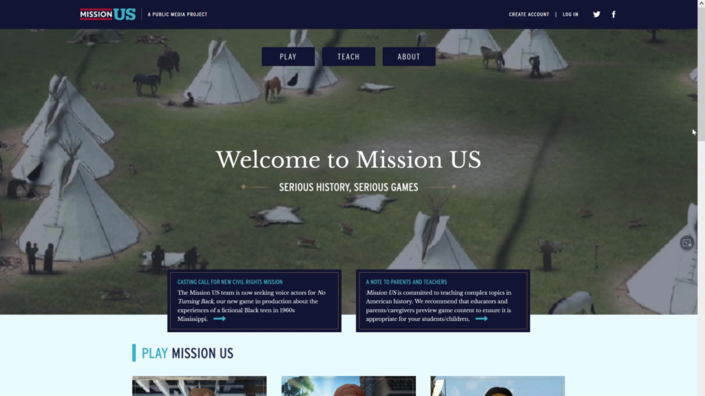
When WNET Thirteen approached Backpack Interactive to redesign the website for their award-winning educational games and materials, Mission U.S., we knew navigational structure would play a large role in helping teachers, parents, and students use the platform.
Mission U.S. transports students to key moments in American history through choose-your-own-adventure scenarios.
The new navigational structure, “Play,” “Teach,” and “About,” makes it easy for each user to self-select the content area that’s most relevant to them.
The menu also reinforces the idea that there’s an educational component to playing Mission U.S. for first-time users.
This includes parents unfamiliar with the game or teachers researching the game prior to classroom use.
The menu immediately reflects that these games can be used in the classroom, giving the product both educational legitimacy and value.
In addition to creating a more interactive experience, the navigation suggests how learning content is sequenced in the product.
This detail further supports teachers who wish to integrate the content into their classroom.
How Listening to Learn Product Navigation Supports Teachers Documenting Student Process Skills
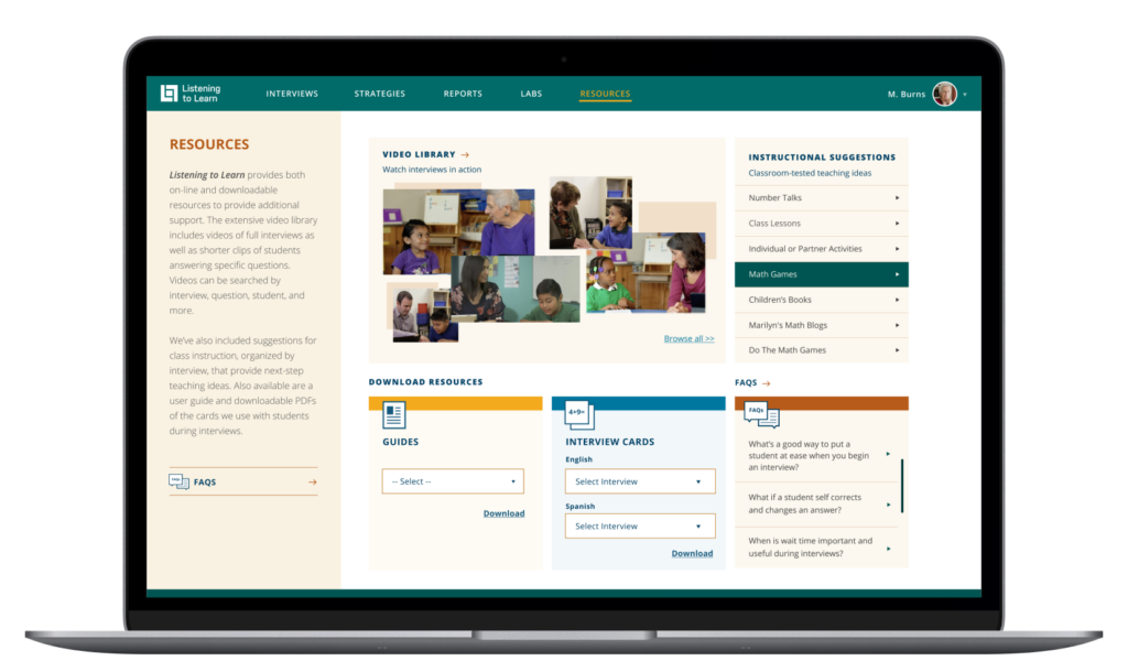
The Heinemann product Listening to Learn is designed to support teachers as they assess students’ numerical reasoning skills through oral interviews.
From the navigation bar, this rich professional learning tool needed to communicate to teachers a sequence of activities.
As the order suggests, first teachers conduct interviews. Next, they might learn more interviewing strategies, run a report on classroom performance, or practice their interview techniques in the “Labs” section.
This user-friendly approach helps teachers quickly understand what they need to do, and where they need to go to accomplish each task.
The language and approach is also integral to the pedagogy behind the tool, which is based on using interviews to assess the process skills students need to complete math problems.
Even for a complex tool, the language in the menu is simple and easy to understand.
Compared to long or overly descriptive titles, this user-centered approach to UX copy better supports users as they make mental models of the site navigation.
How the Product Navigation for NSGRA Helps Teachers Implement Reading Assessments
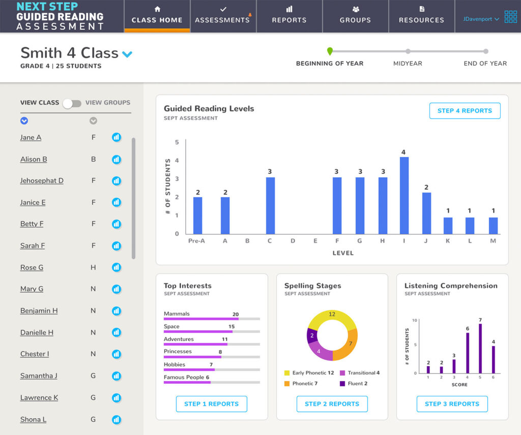
Scholastic’s Next Step Guided Reading Assessment, or NSGRA, helps teachers accurately determine their students’ reading levels.
The tool provides teachers with insights into how individual students are developing as readers, as well as targeted resources for improving reading skills.
After collecting assessment data, teachers create reports and group students in their reading classroom.
When Backpack Interactive designed this tool, we ensured that the navigation sequence reflected the order of operations for teachers.
Conducting assessments, running reports, and creating student groups are the most important tasks for the user, while the resources section provides additional support.
Because of the importance of navigation to the NSGRA, we conducted rigorous user tests in real classrooms.
In particular, we used UX prototyping to test sequences and collect teacher feedback on the tool’s navigation. Then, we applied user feedback as we headed into final designs.
4 Ways to Identify the Best Navigation Sequence for Your edTech Product
You’re about to start designing a new learning tool that showcases the hard work of subject matter experts and your content team.
How can you use early stakeholder discussions to uncover the best navigation sequence?
My team has led countless discovery sessions to figure out this exact challenge.
Here are four questions you can ask to help your product team organize learning content more effectively and create a great learner experience through UX and UI design choices.
1. What is the classroom sequence for teaching or learning this concept?
Consider the steps that go into teaching this concept in the classroom.
If the product is student-facing, what are the steps students need to take to learn this new concept?
If there’s a way to name and quantify those steps, use this as a jumping-off point for product navigation.
By doing this, your navigation gives users an at-a-glance understanding of how the product works, as well as what to expect next.
That’s context and an organizational structure in a simple glance.
2. Does an “active” navigation system work for this content?
While active verbs like “teach” and “plan” can be excellent menu titles, this strategy doesn’t work for all edTech products.
If you attempt this type of navigation system, make sure there are equal and reasonable amounts of content in each area.
If 90% of your content winds up in one area of the product, you may need to add sub-navigation or use an alternative form of navigation.
With enough desk research and collaboration with your content team, you can determine whether this model is the right choice for your learning tool.
3. Is this a pattern we can follow in the rest of the product?
The way you organize your product’s menu shapes how users understand and interact with it.
For example, menu labels like “Pre-test,” “Unit,” and “Post-test” set clear expectations: they suggest that each unit includes both a pre-test and a post-test.
Whatever structure you choose, it’s important to stick with it throughout the product.
Consistent patterns help users:
- Know where they are
- Track their progress
- And understand what’s coming next
This kind of clarity is especially important in the classroom, where timing matters.
Teachers need to know if they have enough time to complete the full sequence of activities before they begin.
If your product structure is well-designed, teachers will be able to plan ahead and finish what they start.
4. What do users need to know to make your content library more effective?
Some edTech products provide a collection of resources for their users.
Helping teachers or students access those resources in an intuitive way is crucial to this content area’s success.
For large libraries, use common UX patterns to make navigation within the area as clear and easy as possible.
Is there a place where teachers and learners can start so the library is less overwhelming?
Is there context your users should know before they dive in?
By conducting user interviews, you’ll ensure that you make this content area a proactive source of support, rather than a last resort for answers or resources.
No matter what kind of learning tool you’re designing, users need a simple, easy-to-navigate menu that helps them understand what to do—and why they should do it in a specific order.
Use your discovery process to uncover more details about the teaching and learning sequence in real classrooms.
You’ll be set up for success as you design a UI that reflects the pedagogy of your content, creating a stronger learner experience overall.
Are you re-thinking the navigation or content sequencing of your learning tool? Contact us below to find out how we can help!

Sean Oakes
Sean has over 20 years of interactive design and account management experience. In 2000, Sean founded SOS, a specialized creative studio based in Brooklyn, NY. He has set the creative vision for the highly regarded firm; the power of thoughtful design and delightful user experience to enable better teaching, learning, and communication.
Sean is a graduate of the Rhode Island School of Design. His work has been recognized by The Webby Awards, Communication Arts, SXSW Interactive, Business Week, The Smithsonian, and Apple.