Design for Education: How to Optimize UX and UI for Better Learning

It takes a lot of planning, research, and skill to design an incredible edTech product. In addition to an engaging user experience and a beautiful user interface, design for educational products requires a nuanced understanding of how people learn.
By applying learning science principles to the user flows in your products, you’ll support students as they learn and retain new concepts. You’ll also help teachers instruct their students more effectively, with ease, and in less time.
Whether you’re new to edTech product design or simply interested in how to make your learning tools more effective, this guide is for you.
Learn the essentials of edTech user flows, how to optimize UX and UI for better learning experiences, and how to integrate both learning science principles and social emotional learning features into your tools.
Table of Contents
- What does great UX design for education look like?
- Essential edTech user flows
- How to optimize UX and UI for learning
- Applying learning science principles to edTech products
- Including SEL features in learning tools
- 5 examples of great UX design in educational products
What does great UX design for education look like?
The goals of user experience design in educational tools are different from the goals of commercial products. In particular, edTech products:
- Help students learn and practice new concepts
- Evaluate students for understanding
- Help teachers assess students
- Make it easier for teachers to manage classrooms more effectively
- And much more.
The stakes for great UX design in learning tools are high. edTech products affect learning, retention, grades, and classroom management, and the user experience must be designed with these goals in mind.
edTech product designers still care about common UX goals, including:
- User engagement
- Task completion
- Easy-to-use experiences
- Tailoring experiences to specific personas
However, because learning tools are used in academic contexts, typical product metrics like “user engagement” must be discussed with more nuance and care. If a learner is disengaged in your edTech product, they risk not understanding a concept that is crucial to their academic success.
For this reason, a great UX designer in education knows how to reflect good pedagogical practice within an edTech product. This could look like:
- Choosing product features that facilitate learning.
- Applying learning science principles to individual features, so that students learn more effectively.
- Working with content and learning/curriculum designers to sequence learning content in the best possible way.
Ultimately, UX design for education is a specialized field that combines knowledge about user experience design with knowledge about the science of learning. This specialized knowledge is reflected in every aspect of edTech product design, including feature design, content design, and user flows.
Essential edTech user flows
Like all specialized design fields, edTech has essential user flows that are integral to how products work in the classroom.
In this context, user flows are the paths that a teacher or a student takes in your edTech product in order to complete a task.
Essential user flows in UX design for education include onboarding, rostering and grouping tools, learning content sequencing, as well as data dashboards and reporting.
Onboarding
Remember when we said that stakes are high in edTech products? That’s especially true for onboarding user flows.
When users log in to your edTech product for the first time, they’re learning how to navigate a new piece of software while also learning a new concept or practicing a new skill.
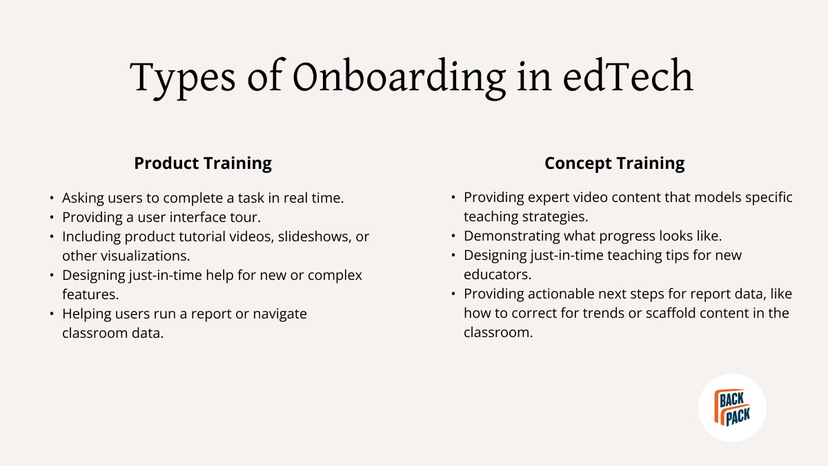
By optimizing the UX and UI of your onboarding flow, you’ll ensure that both students and teachers can use your product with ease. In UX design for education, this means balancing product training tasks with concept training tasks.
Product training tasks help users get the most out of your product features. Concept training tasks, on the other hand, support edTech users as they learn a new academic concept. Applied to a teacher persona, concept training tasks help educators teach subject-area content more effectively using your tool.
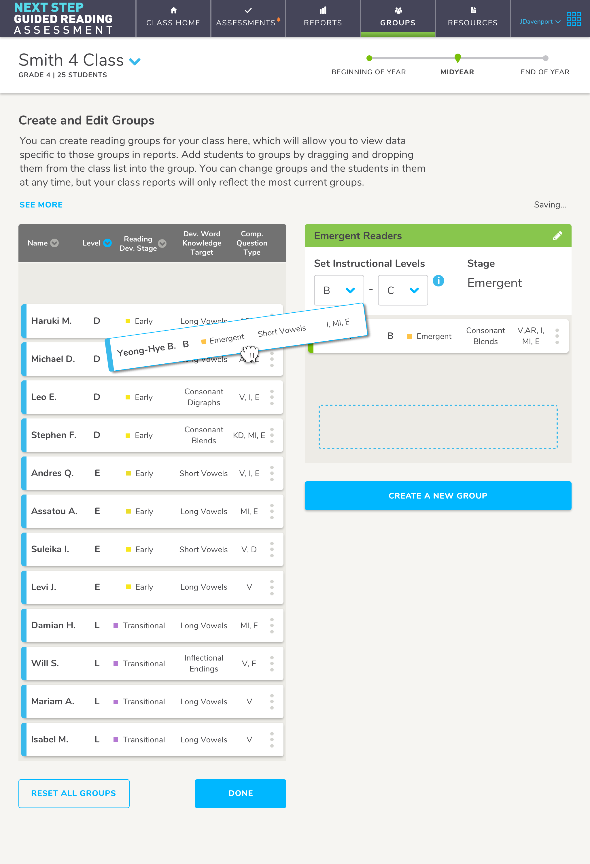
Rostering & grouping
Class rosters and student grouping tools are complex edTech features. Rostering workflows help teachers capture and organize details for all their students in order to manage their classroom digitally. UX designers often create a rostering wizard in order to make this workflow easier. You can also create an API handshake with existing products like Google Classroom or Clever.
A grouping feature, on the other hand, helps teachers group students based on instructional needs. Thanks to AI, it’s easier than ever to make automated grouping or classroom management suggestions to teachers that help them save time.
Optimizing the UX for these user flows requires careful problem solving and testing, so you solve for the biggest pain points teachers have in their classroom. By helping teachers do less manual labor in your edTech product, you’ll make rostering and grouping workflows more valuable to educators—and more supportive of student needs.
Learning content sequencing
Great edTech product design involves a collaborative effort between UX and content designers. Because content sequencing has the power to give users agency over their learning goals, strong UX choices in this workflow contribute to a better overall learning experience.
Unlike print learning content, digital content can be broken down into discrete components that add back up to an entire user flow. Most importantly, your learning content must be presented in a way that minimizes overwhelm. Specific content sequencing strategies will support this goal, including:
- Spreading content across multiple screens for digestibility
- Including progress monitors, so students know where they are and how long a lesson or task will take
- Integrating just-in-time help to keep students moving through lessons
The more your UX design choices give students options for moving through learning content, the easier it will be for your users to work at their own pace and make choices about what and how they learn.
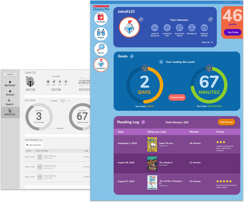
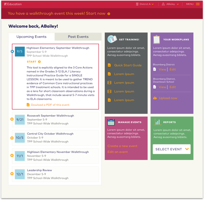
Data dashboards & reporting
Data dashboards provide educator personas at-a-glance updates on how their students are performing within individual classrooms, across an entire grade, or throughout an entire school district.
Actionable data is crucial to great user experience design for education. Without overwhelming users, data dashboards and related reporting flows must use data to provide concrete next steps for educators to take, including:
- Addressing classroom trends
- Identifying students who need help or who are under-challenged
- Suggesting classroom activities
- Referencing specific assessments within the product
Students benefit from data dashboards, too. When encouraged to choose their own learning goals and track progress, students have more agency, are more motivated, and learn more effectively. Strong UX and UI design choices make student data dashboards clear, encouraging, and delightful while promoting the learner agency that affects outcomes.
How to optimize UX and UI for a better learning experience
Designing edTech products is a specialized field. While we want to optimize learning tools to work in classrooms and on-the-go, we also need these tools to deliver valuable learning experiences to students.
In addition to using standard UX design principles, you’ll also have to conduct in-depth user experience research to understand how to best support the complexities of teaching and learning with your tool.
Draw on standard UX design principles
UX design for education draws on standard user experience principles. These principles include:
- Prioritizing ease of use by simplifying complex features, user flows, or concepts
- Supporting user engagement through interactivity, rewards, and other motivators
- Demonstrating user progress through the experience
Keeping these UX design principles in mind is especially important when working on complex user flows like rostering and reporting. The more you can simplify these complex user flows, the easier it will be to support busy teachers who have little time or patience for learning complex and clunky new technology.
Simplicity in UX design for education is also key to sequencing learning content for students. By supporting user engagement goals and demonstrating progress, you’ll keep students motivated and excited to learn complex new concepts.
Conduct UXR to understand the nuanced needs of edTech users
In order to optimize for the specific needs of edTech users in learning tools, you’ll have to conduct user experience research.
A strong UXR strategy in edTech includes qualitative interviews, user testing, and competitive audits, among other types of research. Ultimately, your aim will be to understand the needs and pain points of edTech personas, including students, teachers, and administrators. Parents are an emerging edTech persona you should consider including, too.
Crucially, teacher personas have infinite variety and nuance, depending on the tool. You might even have multiple types of teacher personas for a single edTech product! In general, these personas are looking for learning experiences that:
- Address the learning gap with adaptive content
- Provide professional development through just-in-time help modals
- Integrate with their existing tech stack
- Align with curriculum standards
UXR also supports optimizing for the best student-facing experiences. Learners need experiences that:
- Motivate and provide agency
- Provide opportunities for peer collaboration
- Support social-emotional learning
- Adapt to their skills and knowledge
As you balance user needs with curricular requirements, your next challenge will be to address the realities of classroom technology.
Simplify complex user flows for mobile designs
Design for education also requires UX teams to consider how they’ll optimize for mobile screens vs. desktop computers.
Mobile devices aren’t always the best way for users to experience the complex features that make up the bulk of edTech products. Optimizing for mobile experiences requires simplifying complex user flows, including data dashboards, reporting, rostering, and grouping.
One of the primary challenges in design for education will be deciding how you can optimize your product’s UX for mobile, while still providing a valuable user experience.
Additionally, most classroom environments have technology challenges you’ll need to keep in mind. From spotty internet connections to a lack of digital devices, you’ll need to optimize for screen size and the school environment.
Applying learning science principles to edTech products
Now that you’ve got the basics down, it’s time to dig into what makes UX design in education really unique.
Most importantly, a specialization in edTech UX design requires an understanding of learning science principles. Learning science principles are research-backed methods for teaching that support how all humans learn and retain new information.
According to Education Week, these include cognitive science principles like “Students learn new ideas by building on their prior knowledge” and “Students are motivated to learn in environments where they feel safe and valued.”
UX designers can reflect learning science principles in edTech product features through user experience and user interface design choices. This doesn’t necessarily mean that you’re creating learning content or a curriculum. But with a deep understanding of learning science, you can help learning content designers sequence existing content more effectively.
You can also apply your knowledge of UX and learning science to break down content designed for a print curriculum into pieces that will work more effectively in a digital product. This requires:
- Understanding how to apply learning science to user experience flows for better learning
- Breaking learning content into a nonlinear experience to support adaptive tools
- Introducing learning content into complex user flows
- Creating teacher-facing products that allow educators to unlock the power of learning science principles
Whether or not you’re working with a content designer, great UX designers in education strategically present the most effective learning experience for both teachers and students. This typically requires using learning science and other research-backed approaches to deliver strong learning outcomes.
How to apply learning science to UX design for kids
Still new to learning science? Here are three easy ways you can incorporate basic learning science principles into UX design for kids:
- Create playful interfaces that help learners absorb new information and concepts.
This helps students contextualize new information and draw connections between new ideas and what they already know. In learning science, this technique is called “elaboration.”
- Give student users the ability to set their own learning goals or choose rewards.
Goal-setting encourages learner agency, which is a research-backed teaching technique. The more agency a student has in your edTech product, the more likely they are to stay motivated and develop grit.
- Incorporate experiments and games that give users a chance to learn new concepts through trial and error.
Once a user struggles, offer additional context or help through “just-in-time telling.” This learning science principle ensures that students learn in real time and have a chance to experiment before being corrected.
Ultimately, there is a strong relationship between UX design and content design in edTech. As the strategies outlined above demonstrate, applying learning science principles to edTech products makes them more engaging, motivating, valuable, and fun.
Including SEL features in learning tools
In addition to applying learning science to user flows, UX designers in edTech must also understand how to integrate social emotional learning, or SEL, into learning tools. SEL features are deeply valued by educators, and they also support better learning outcomes for student users.
What is SEL?
According to the Collaborative for Academic, Social, and Emotional Learning (CASEL), social emotional learning is a process for learning and applying skills that help you:
- Develop healthy identities
- Manage emotions
- Achieve personal and group goals
- Demonstrate empathy for others
- Establish and maintain supportive relationships
- Make responsible and caring decisions
Including SEL features in edTech products is a user need accelerated by the pandemic. As students returned from at-home learning, for example, teachers noticed students needed help interacting with one another in the classroom.
Because of their time apart, students struggled to learn how to be part of a real-life community. After all, interacting with peers via text or on video chat is an entirely different skill!
Adding SEL features to your edTech product for better learning
You can support the increasing need for social emotional learning by incorporating SEL features into any kind of edTech product, from math and science tools to English Language Arts products.
In fact, learning science principles tell us that it’s better not to isolate SEL skills at all. Instead, it’s more effective to integrate SEL skills into existing learning content and provide students a context for practicing them.
Looking for SEL feature ideas? In your student-facing experience, consider adding:
- Constructive ways to comment on another student’s work or interact with peers. You can even use AI to flag when comments are inappropriate or overly critical.
- Provide students with micro prompts when they get stuck
- Encouragement for thinking through the steps of a project, essay, or experiment
- Infographics or visual explanations of creative thinking skills, including:
- How to break a task into smaller parts
- How to review drafts with a team or a teacher
- How to use design thinking skills to be more creative
Designed with intention, SEL features in edTech products give students a chance to learn about a topic, as well as how they interact with others and create things for themselves.
When students have more opportunities to investigate their own collaborative and creative skills, they develop stronger SEL skills—and learn more effectively.
[et_bloom_inline optin_id=optin_10]
5 examples of great UX design in educational products
Here are 5 examples of edTech products that deliver a great user experience for kids, as well as a beautiful user interface that helps users learn more effectively.
1. Duolingo
Duolingo is a language learning app that makes learning a new language friendly and fun.
From a UX design perspective, this app is the gold standard of learning through gamification. Users earn badges, points, and move up levels as they improve their language skills. These game mechanics provide a clear indication of progress, a helpful UX design principle for all types of users—but especially in design for education.
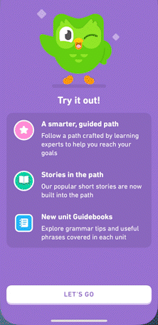
Duolingo also provides a smooth onboarding process. Starting your account and learning a language is broken into discrete steps that users perform over time. This way, users are less likely to feel overwhelmed.
Like all good UX teams, Duolingo rolls out product updates and refined features that are tied to user testing and consistently monitoring interaction analytics. Be sure to study Duolingo’s UX and UI for more ideas on how to optimize your own learning tool!
2. Khan Academy Kids
Khan Academy Kids teaches users foundational academic skills using social emotional learning and play. Aimed at users aged 2 to 8, the software features age-appropriate language and imagery, including colorful animal characters.
Like Duolingo, learners in Khan Academy Kids are also rewarded for their persistence, and they always understand how much progress they’re making. Overall, the app models sharing, playing, and healthy emotional regulation, which are key principles of social emotional development.
3. Waggle
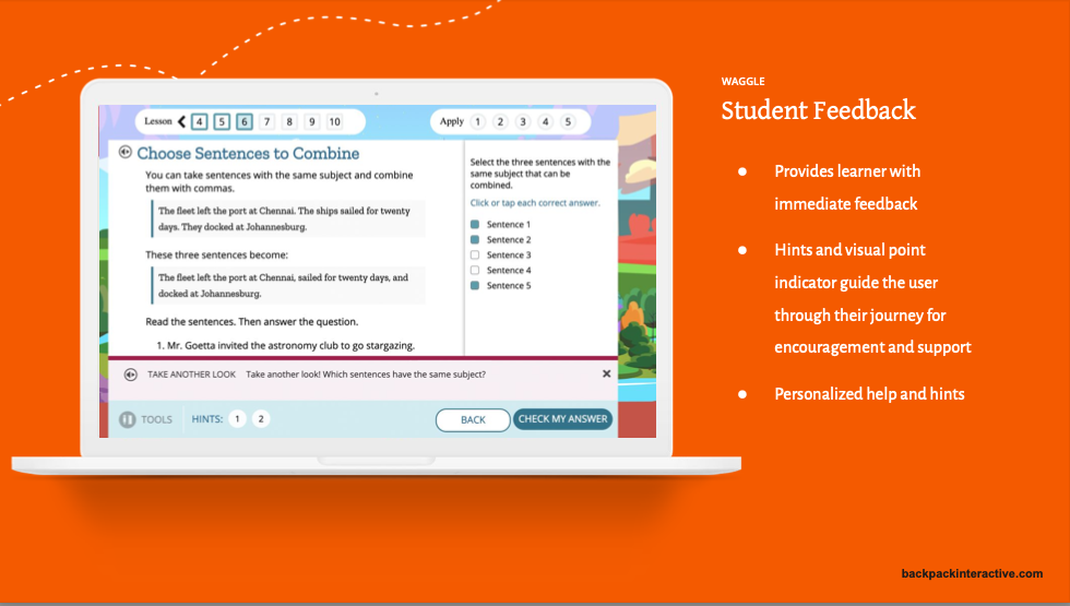
Designed for students in grades K-8, Waggle offers Common Core-aligned instruction and assessment for both reading and math skills. Its features include adaptive content, communication tools, planning tools for teachers, as well as actionable data and student feedback.
For example, Waggle tracks individual students’ performance over time. With enough student data, Waggle will provide content suggestions based on a learner’s individual skill levels. It will also adapt assignments based on student competency, making it easier for teachers to differentiate their lessons.
This is a great example of adaptive content design that supports both teachers’ instructional needs and the individualized needs of learners.
4. Lalilo
With its combination of gentle colors and warm imagery, Lalilo integrates many SEL principles into a digital literacy tool for Kindergarten through 2nd-grade teachers and students.
The UX is engaging, provides immediate, specific feedback, and encourages learners to persist as they progress through the app. By marking lessons a student has completed with a gold star icon, the UI also provides a clear indication of learner progress and accomplishment.
There’s even an audio reader for additional support, helping non-readers to receive positive affirmations for their work and to navigate easily throughout the tool. This feature is critical for edTech products in literacy content areas, making Lalilo a stand-out tool for young readers.
5. Mathspace
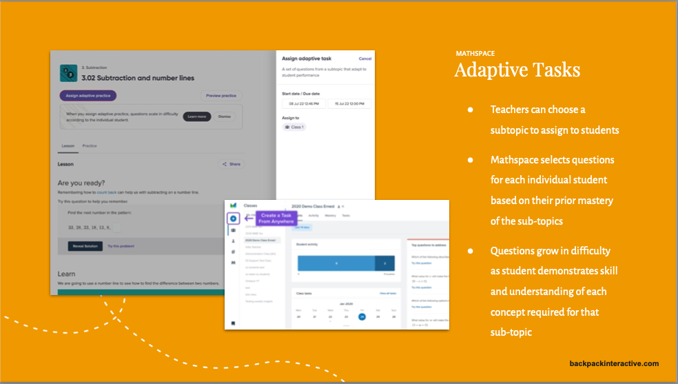
Mathspace is a math instruction tool with content that ranges from 3rd grade to high school-level concepts.
Like Waggle, Mathspace adapts learning content to the individual needs of students. The product will select questions based on a student’s prior mastery of a topic, and, as students progress, the questions grow in difficulty.
Within the student-facing experience, Mathspace provides learners with hints for each question. After a lesson, the tool provides a score showing any areas where improvements are needed. Learners can watch refresher videos to revisit a confusing concept and answer additional practice questions to build their confidence with a new skill.
This is a great example of adaptive content design, as well as providing just-in-time help for student users to reduce friction and boost engagement.
When better UX design leads to better learning outcomes
Designing digital products for education requires specialized skills, user experience research, and a lot of creativity.
In addition to applying standard UX design principles to learning tools, you’ll also need a foundational understanding of learning science. This way, you can design solutions that meet teachers’ and students’ most pressing needs, from adaptive content to social emotional learning.
When you design edTech products with these UX goals in mind, you’ll also design learning tools that deliver better learning outcomes—and offer more valuable experiences to each of your users.
Interested in learning more about the best SEL features to include in your learning tool? Download our free competitive audit to gain industry insights and feature ideas!
[et_bloom_inline optin_id=optin_10]

Sean Oakes
Sean has over 20 years of interactive design and account management experience. In 2000, Sean founded SOS, a specialized creative studio based in Brooklyn, NY. He has set the creative vision for the highly regarded firm; the power of thoughtful design and delightful user experience to enable better teaching, learning, and communication.
Sean is a graduate of the Rhode Island School of Design. His work has been recognized by The Webby Awards, Communication Arts, SXSW Interactive, Business Week, The Smithsonian, and Apple.