8 Accessibility Best Practices for edTech Products with Alternative Inputs
Whether you’re designing a learning tool that uses voice recognition or you’re planning the UI for a student handwriting app, new technologies create new challenges for accessible design.
How do you indicate to learners when a voice recognition tool is “listening” to them?
Or plan for edTech products that rely on audio feedback to work effectively when used in noisy classrooms?
Even if you account for these complex student interactions, how do you ensure that you haven’t accidentally introduced new barriers to accessibility?
In this article, we’ll guide you through accessibility best practices for learning tools that use alternative inputs, like voice and handwriting recognition.
By deeply considering the needs of all your users, you’ll design complex edTech products that meet the needs of learners at every level.
Plus, we’ll help you avoid some common accessibility pitfalls that arise when learning technology becomes more complex.
Let’s dive in!
How to Make Voice Recognition Assessment Tools Accessible for All Students
Voice recognition is a powerful feature for all learners, and it’s particularly helpful as an assistive technology for students who have physical or cognitive disabilities.
After all, it can be much easier for these learners to speak than to write or interact with a learning tool.
But if you’re designing an assessment tool that uses voice recognition as its primary form of input, the story changes.
Students with speech impairments or accents are suddenly at a disadvantage.
Even older learners might wonder when to start or stop speaking—or if your edTech product has correctly captured their response.
Here are 4 best practices that will help you meet goals for accessible edTech UX design:
1. Make the timing of student interactions crystal clear
Learning tools that require students to speak as part of an assessment must make it very clear to students when the interaction begins and ends.
Your UI should help learners understand:
- When it’s time to speak
- When it’s time to listen
- And when it’s time to move on
You can design for this in a few ways, including:
- Visual countdowns to the interaction
- Screen indicators, like pulsing recorder buttons or other animations that show they’re being recorded or listened to
- Response summaries that allow users to review what the system heard and ‘approve’ the response before they submit it
- Audio-based feedback for visual indicators to support learners using screen readers
Because user flows that incorporate voice recognition technology are relatively complex, it’s also important to reduce a student’s cognitive load as much as possible throughout the assessment.
Make sure your screen only displays the passage learners should read aloud, or the activity they should complete, during that portion of the assessment. That way, they can focus on the task at hand—not on using the application.
2. Personalize learning content to individual learners
Every learner is different. Voice recognition technology that’s personalized by learner profile will make your assessment tool more accurate and accessible.
This can be accomplished through the technology itself, by recording and saving the speech patterns of individual learners. This way, students with accents or speech impairments can still be assessed fairly.
In addition to personalized speech profiles, you can also personalize learning content through differentiation and scaffolding. In assessment tools, in particular, it’s crucial to differentiate content for students with other abilities.
With your learning content team, you can also map out a variety of pathways for learners who may need more help or practice with concepts before they begin an assessment. This way, students receive targeted support around learning gaps right when they need it the most.
3. Consider the classroom environment
While this is true for all edTech products, the classroom environment will doubly affect assessment tools that use an input like voice recognition.
Throughout product design, you’ll have to correct for feedback, white noise, or other disruptions.
Teachers should also be aware of how to use your learning tool, including any tools they might need.
Include requirements and tips in product onboarding, whether that’s using noise-canceling headphones or conducting trial runs with students prior to an assessment.
4. Give students a chance to practice
Complex learning tools can be daunting for even the most tech-savvy student to use—especially if the tool is related to an assessment.
Consider designing user flows that support practicing interactions, so learners can feel comfortable as they complete an assessment-related task.
Guided content and ‘practice’ user flows aren’t just good for student onboarding, either. They can also be great ways for your product team to collect and iterate on data.
This way, you can continue to improve the clarity of your UI and ensure the overall effectiveness of your learning tool.
Designing Accessible Learning Tools with Handwriting Recognition
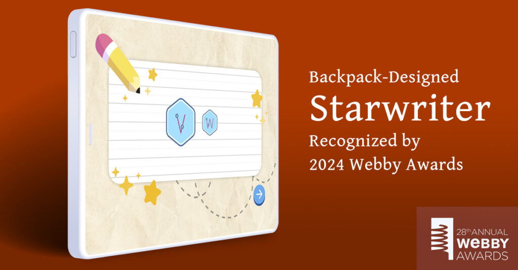
Last year, we worked on Starwriter, a handwriting education app for young learners. (It was even recognized by the Webby Awards!)
Together with our learning content team, we worked hard to make content as accessible as possible, down to planning for specific types of hardware.
Here are 4 best practices for accessible design our team learned by making such a complex tool more inclusive for all learners:
1. Provide learners with immediate feedback
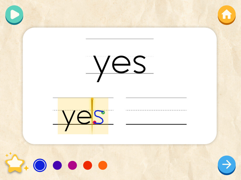
Starwriter asks students to trace lines and make shapes as they learn how to form letters. If a user doesn’t trace the line correctly with their stylus, the product provides immediate feedback.
In addition to turning the traced line a different color, Starwriter delivers audio feedback. Because Starwriter users are typically pre-readers, we worked with our learning content team to develop and record audio feedback messages. These ranged from activity directions to encouragement.
By accounting for the developmental age of our users, providing multiple forms of feedback, and helping users get back on track with the task at hand, we made Starwriter’s activities as accessible as possible for young learners.

2. Create content scaffolding and guidance for learners
Providing student guidance, content scaffolding, and differentiation in instruction are all crucial best practices for making learning content more accessible.
In Starwriter, for example, we included video content for users that broke down skill components into easy-to-understand pieces. That way, young learners could practice drawing lines and circles before they created letters.
We also mapped out pathways for students who needed more help. Our system recognized when students needed to practice a shape or letter and would recommend related activities to help them continue to make progress in the app.
Like voice recognition tools, handwriting recognition applications may introduce accessibility issues for learners who struggle with motor skills. Differentiated instruction for these students becomes even more important for accessibility.
Not only will they need more content scaffolding, but this use case should also require your learning content team to think through how you might assess students with physical needs in a different way.
3. Build student handwriting profiles
Introducing student profiles that save handwriting styles is just one way to plan for student differences and improve overall accessibility.
As we worked on Starwriter, our curriculum leads pushed for personalized student profiles.
Their goal was to help teachers see individual student handwriting style and provide tailored options for helping students with targeted instruction.
4. Plan for device adaptability
Starwriter is designed specifically for use on tablets. We also wanted as many schools as possible to adopt the tool, which meant accounting for hardware limitations as we designed.
Because underfunded schools don’t have access to active writing styluses, we designed Starwriter to work with passive styluses—a serious design and development challenge!
Unlike a more expensive, active stylus, a passive stylus won’t help the tablet recognize a student’s palm resting on the screen.
In order to plan for this limitation, we had to identify, design, and develop around technical constraints.
While this challenge could have been solved simply by designing for an active stylus, it would have put the program out of reach for many schools—simply because of the cost associated with these technology requirements.
No matter what type of tool you’re building, designing for device adaptability and common technology limitations will make your edTech product more accessible overall.
Congratulations! You’ve differentiated your learning content, accounted for environmental needs, and iterated on your user interface.
You’ve ticked almost every box on our accessibility best practices checklist for complex learning tools—and you’re bound to see a strong ROI for all your efforts.
After all, the more you plan for different kinds of inputs, the more accessible your learning tools will be for all students.
In a crowded edTech marketplace, thoughtful, accessible design choices will stand out every time.
Are you and your team working on an edTech product that uses voice or handwriting recognition?
Learn more about Backpack Interactive’s work on Starwriter. See how we designed a complex learning tool with alternative inputs and won recognition from the Webby Awards in the process!
Read the case study

Sean Oakes
Sean has over 20 years of interactive design and account management experience. In 2000, Sean founded SOS, a specialized creative studio based in Brooklyn, NY. He has set the creative vision for the highly regarded firm; the power of thoughtful design and delightful user experience to enable better teaching, learning, and communication.
Sean is a graduate of the Rhode Island School of Design. His work has been recognized by The Webby Awards, Communication Arts, SXSW Interactive, Business Week, The Smithsonian, and Apple.


