Literacy Pro

Overview
This comprehensive independent reading platform was the result of 18 months of creative strategy, UX and visual design. The web-based application allows students to independently choose eBooks from Scholastic’s vast library, set reading goals, take quizzes and track their time. Teachers and school administrators have easy access to powerful reports about student performance.
What We Did
-
Strategy
-
Product Ideation
-
-
Design
-
UX Design
-
UI Design
-
Illustration & Animation
-
Accessibility Compliance
-
Getting Kids Onboard
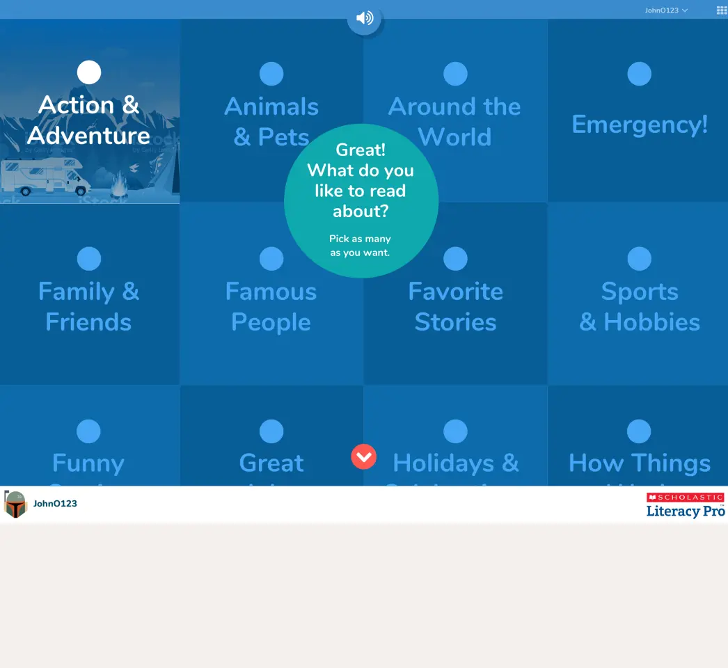
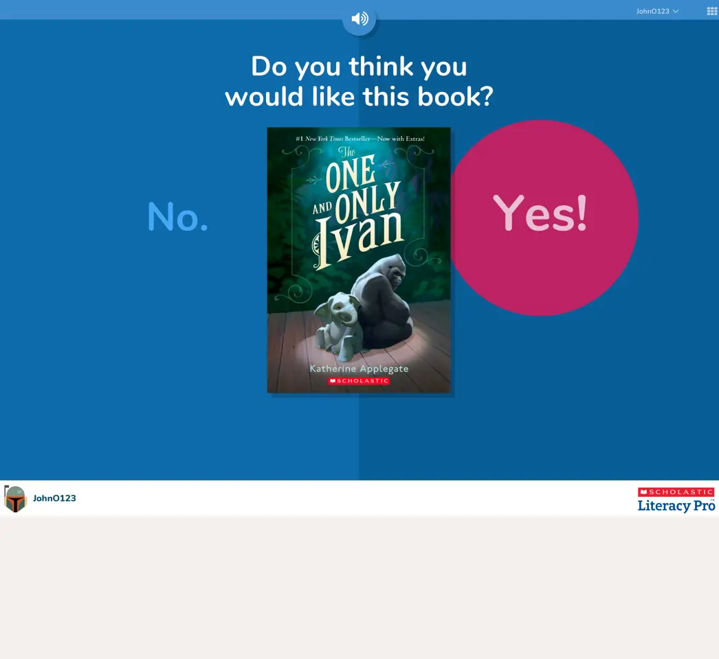
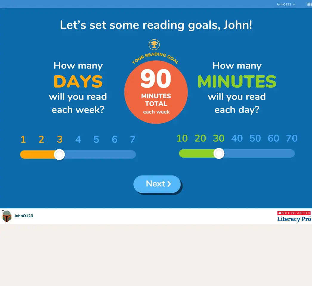
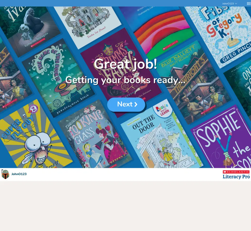
To welcome new learners to the product and level-set their profile, we created a fun, game-like experience to help them find books they'll love and set goals they can attain. Big buttons, great titles, and engaging animations set a playful tone and get kids excited about reading.
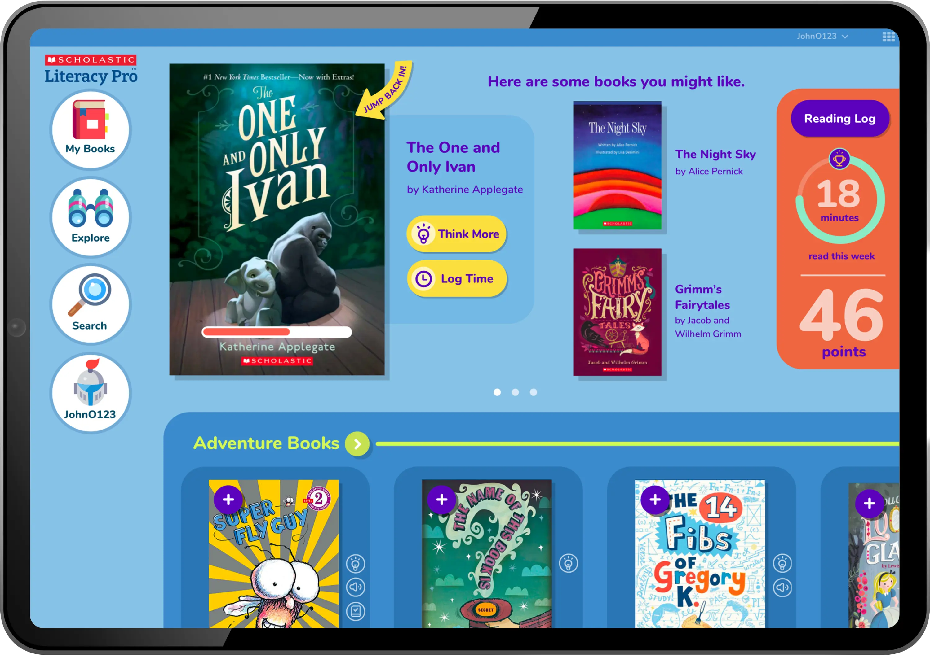
Powerful Features Made Easy
We designed features like Search to work as well for power users as for pre-readers. The interface uses icons to initiate searches based on the learner’s interests. Books expand to show additional information, including whether it matches that user’s reading level.
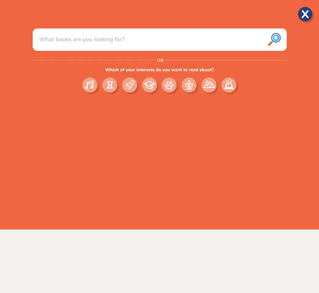
Search Includes Icons for Early Readers
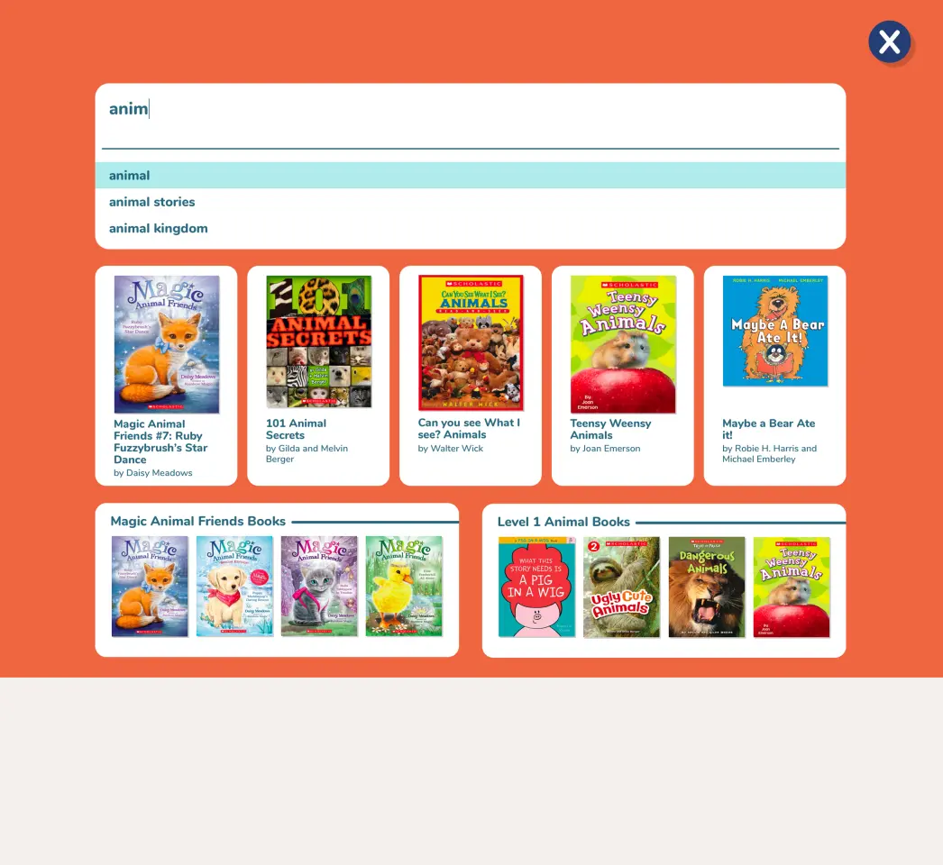
Type Ahead Features Book Covers & Collections
Planning & Prototyping
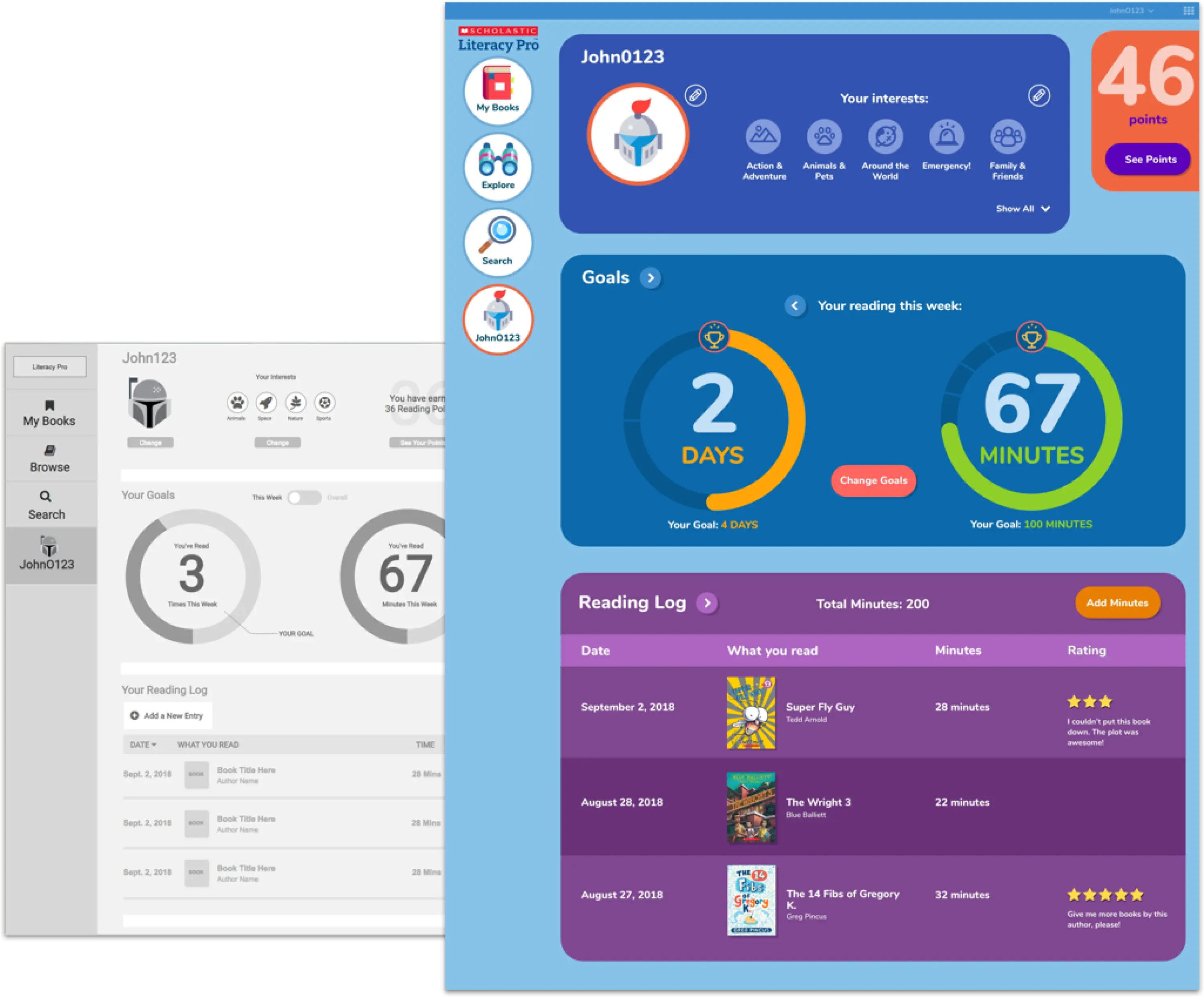
Our process of dreaming up features for a product like this starts with sketches and building quick prototypes. We create interactive wireframes and show them to the team, then to users, and make improvements based on the feedback.
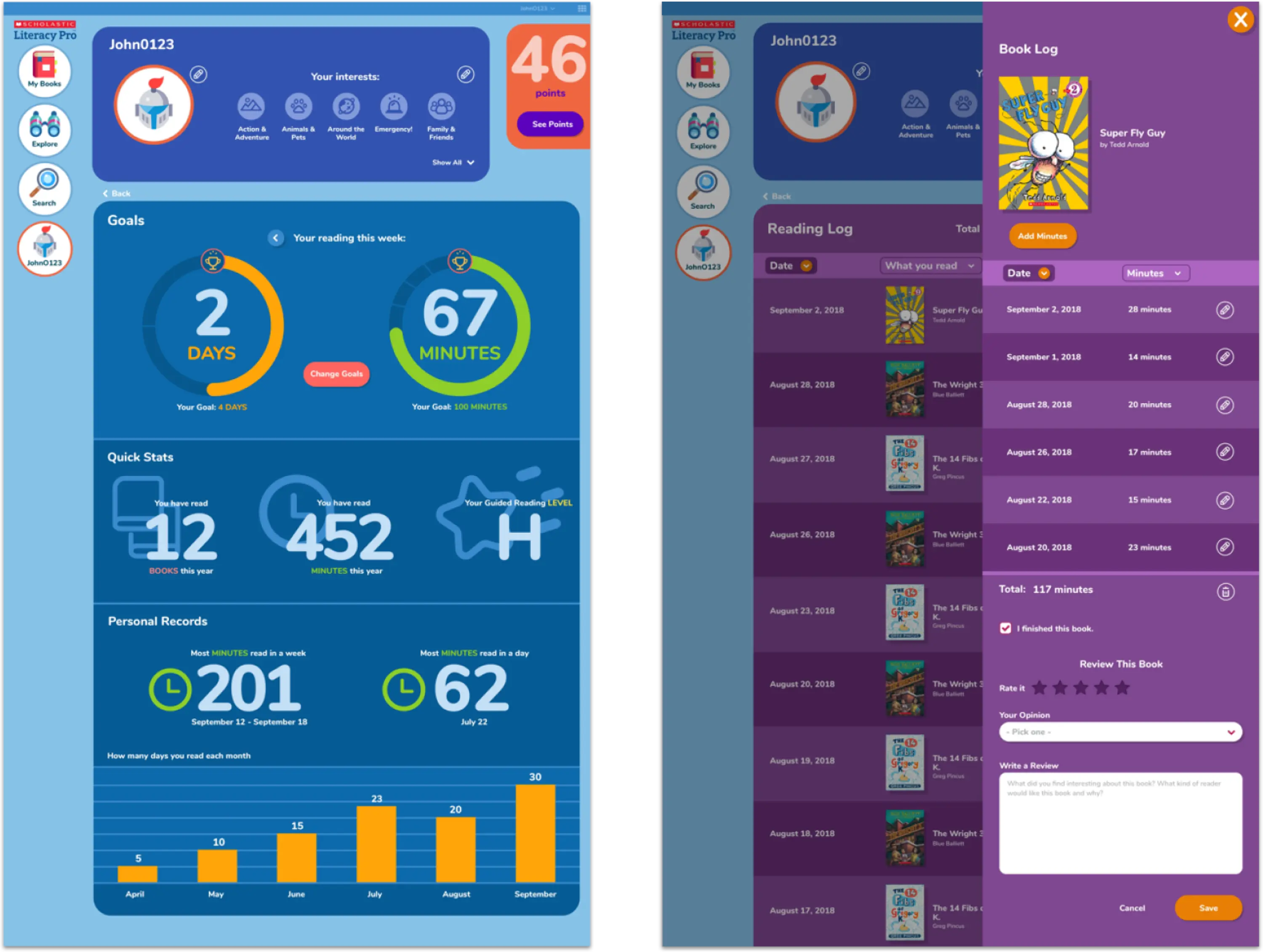
We found that kids loved this fun way to pick avatars, set reading goals and track their progress. Literacy Pro focuses on a learner’s agency to motivate them to become more avid readers. Allowing them to make other choices and personalizations throughout the product was a natural extension of that approach.
The Teacher Experience
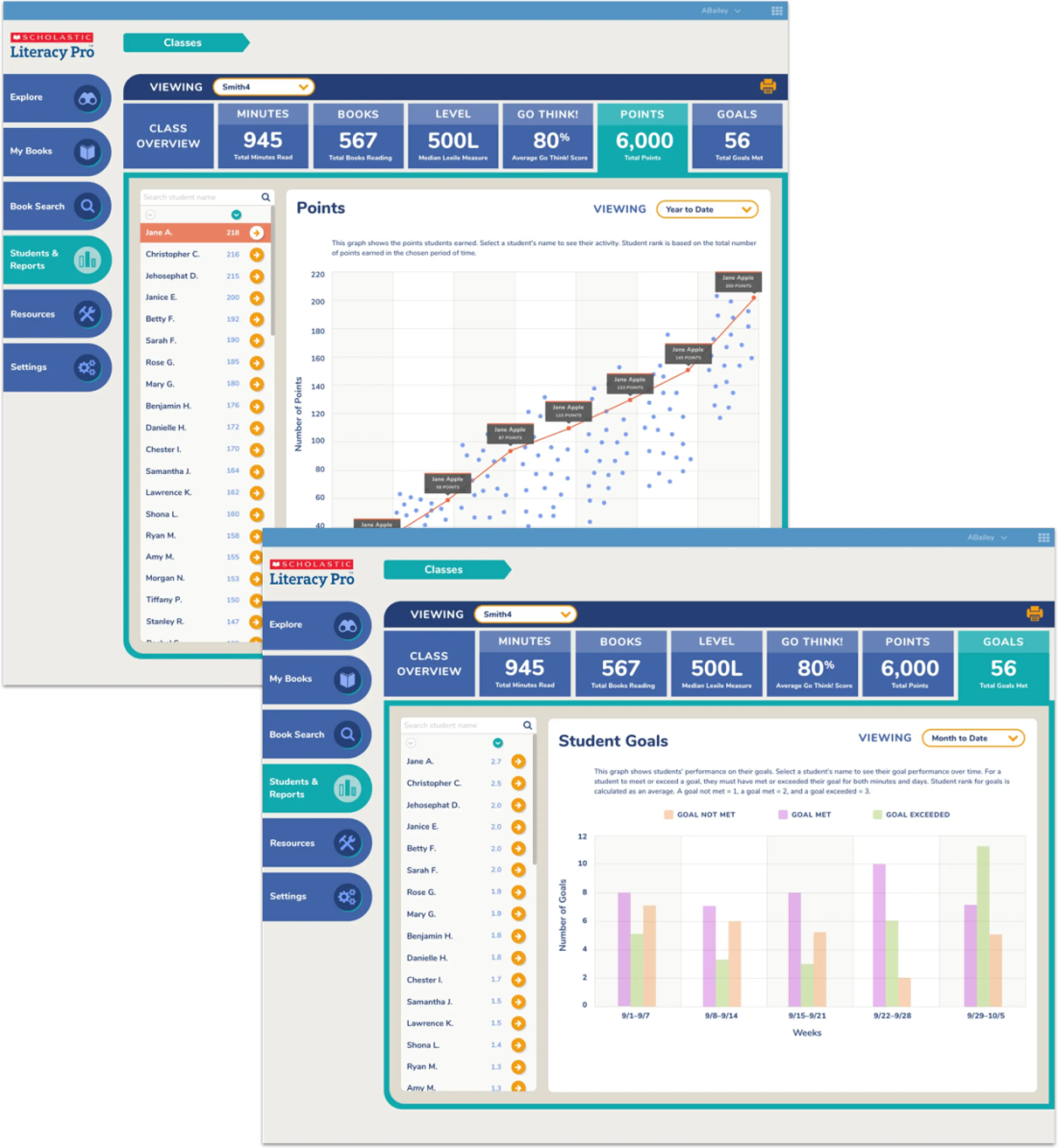
Our goal for teachers was to allow quick access to the most essential data, while also making it easy to dig into details with just a few clicks. The interactive data presentation is designed to show both class-wide trends and students who are outliers and need attention.
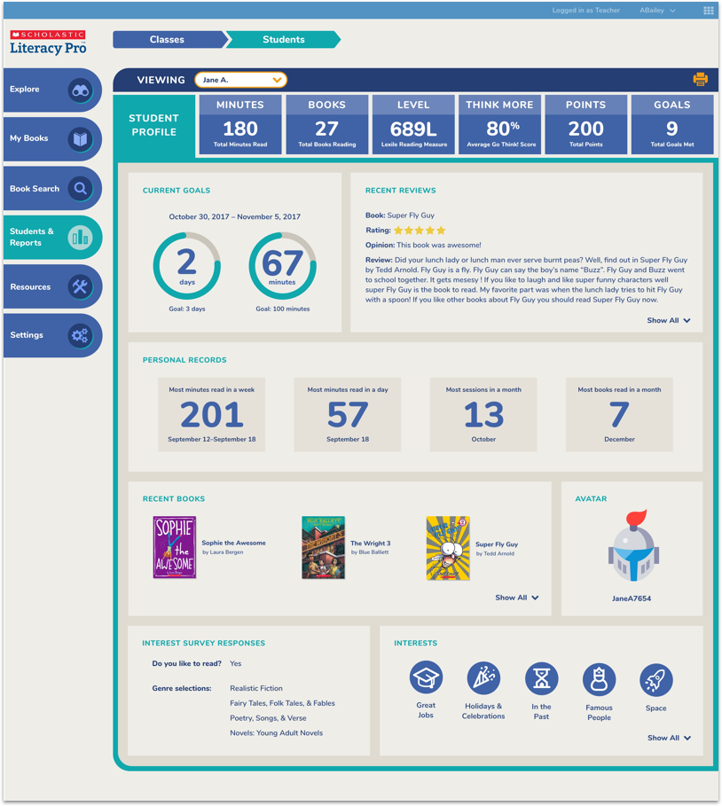
An at-a-glance student overview report lets teachers see their student’s areas of reading interest as well as their goals progress, time spent with books, and comprehension.

Work with us!
Ready to get your project off on the right foot with an EdTech-specialized team?
Let's Talk
