UX Strategy: How to Create More Inclusive and Effective Designs
As the first billion-dollar edTech product, Scholastic’s Read180 is often cited as one of the most successful digital learning tools of all time. Houghton Mifflin Harcourt, which bought the reading intervention app from Scholastic in 2017, understood this when they leveraged a strong UX strategy to build on Scholastic’s early successes.
In 2019, the company conducted user and market research, fine-tuned their strategic priorities, and delivered a high-impact tool with great learning content. This catapulted them to the top of the growing edTech industry—right as educators shifted to at-home learning at the beginning of the pandemic.
The success of a product like Read180 isn’t just about luck or timing. It’s also about well-matched business goals and user needs, all of which must be outlined in your product’s UX strategy. This guide will help you develop a successful user experience strategy for your learning tool, so you can design the best edTech products—and the best learning experiences—for your users.
Table of Contents
- What is UX strategy?
- Why is strategy so important in edTech product development?
- Components of UX strategy
- How to translate product requirements into great educational experiences
- Measuring the effectiveness of your UX strategy
- How to improve the UX strategy of your edTech product
- The ROI of UX strategy
What is UX strategy?
User experience strategy is goal-driven UX design that balances research, business needs, and product requirements. Services like product ideation, market analysis, and user research can all fall under its umbrella.
In edTech, the UX strategy for a specific learning tool should ultimately help product owners translate business requirements into an engaging, usable experience for teachers and students.
By using a human-centered design approach, your team will take into account both how people learn and how they interact with your product—two elements integral to the success of your learning tool.
Why is strategy so important in edTech?
Businesses that make decisions based on well-researched and reasoned strategies tend to minimize risks and thrive. Having a UX design strategy for your edTech product is no different.
A strategic approach to UX design ensures that your learning product is effective and easy to use, starting from the earliest stages of product development and planning.
You can also use UX strategy to:
- Validate that you’re building a tool customers want, that addresses a pain point, and that meets a defined user need
- Lay the foundation for inclusive design practices, which will improve your overall UX
- Present your learning content in the best way for your organization, especially if you have already invested millions in a print curriculum
- Build user engagement because the product is fun and easy to use
- Support the needs of your sales team by making it easier to sell a useful, attractive, and exciting tool.
A well-defined UX strategy ensures key product outcomes, including the effectiveness of your learning product and its likelihood of being adopted, used, and recommended by both teachers and learners.
Components of UX strategy
Creating a new learning tool requires a strategic approach, so you and your team can feel certain about investing design resources in the right edTech product.
Based on market and user research, your UX strategy will collect:
- Business or product goals and requirements
- Tactics for achieving your goals
- Recommendations for product features that meet both user needs and business requirements
By taking a user-centered approach to strategic product design, you’ll mitigate the risks of bringing a brand new edTech product on the market. You’ll also ensure that your learning tool is effective, easy to use, and ready for schools to adopt.
While every strategic engagement is unique, the basic building blocks of creating a UX strategy include some combination of stakeholder workshops, user research, and ideation.
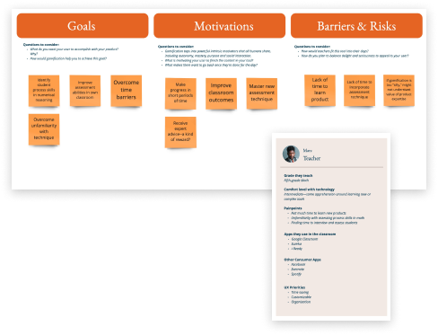
Stakeholder workshops
During stakeholder workshops, your product and user experience teams will aim to align on the experience goals for your learning tool. How will you deliver a UX that is both on-mission and on-brand for the company, while meeting the needs of your users?
Alignment on these goals, outcomes, and initial tactics is key to making progress on product ideation. Typically, stakeholder workshops take place during a UX discovery process.

User research
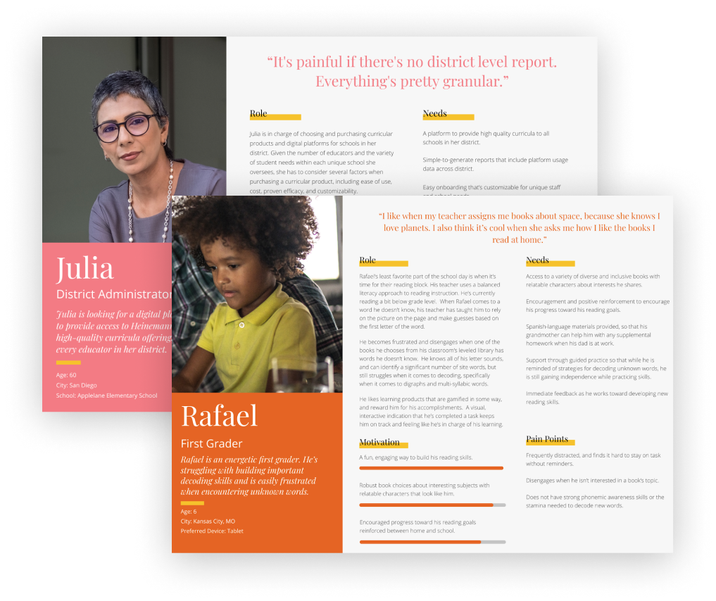
Through client interviews, persona analysis, and market research, your UXR team members will validate user pain points, needs, and opportunities in the edTech marketplace. As your product team develops and prioritizes features for your learning tool, you’ll be able to ensure you’re on the right track.

Additionally, the best way to make your edTech products more inclusive and effective is to adopt an inclusive mindset at the earliest stages of UXR. Inclusive UX design and research practices aren’t just the right thing to do—they’re smart business tactics.
Inclusive design approaches, like the Universal Design framework, ensure that your product is effective for the widest group of teachers and learners. Plus, inclusivity is often a baseline requirement from schools or administrative buyers.
Every research element, from user recruitment to survey methodology, makes an impact on the usability and accessibility of your product. When you build inclusivity into your strategic approach, your team will more effectively determine feature priorities and design edTech products genuinely representative of user needs.
Product ideation
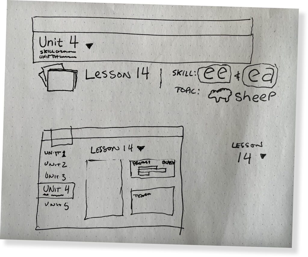
Once your team has aligned on goals and conducted UXR, it’s time to start developing product ideas. Typically these early discussions are facilitated through design thinking workshops that prioritize decision making, so your team can move forward in the product design process.

You can use numerous methods to help stakeholders envision product ideas and align on the concepts that meet your UX strategy. These methods include:
- Sketches
- User flows and flow charting
- Low-fidelity wireframes, or wireframes that are “good enough” to support decision making
- Light-weight prototyping
Remember: your entire product team will need a strong understanding of product and user goals before you design wireframes that solve real creative challenges. Together, you’ll develop ideas for product features that more fully support your users, align with your existing learning content, and meet business requirements.
Product and design requirements
Last but not least, you’ll develop an outline of product and design requirements that reflects your strategic work. If this is a list your company already made based on business needs, don’t worry. There’s still time to conduct UXR to validate user needs and choose features that will both support your users and your business.
How to translate product requirements into great educational experiences
As UX designers in edTech, we all want to create learning tools that support teachers and students and lead to better learning outcomes.
Follow these 4 steps to balance UX strategy, learning content, and business requirements for a better learning tool—and get buy-in from other stakeholders.
1. Embrace user-centered design principles
Before you make assumptions about what your edTech product should be, back up and make sure you understand your users’ needs and preferences.
If you’re only considering your company’s existing learning content or your business requirements, you’re missing a crucial piece of the puzzle.
2. Find the delta between product requirements and user needs
Next, look for where business needs and user needs align. You can do this by:
- Validating product requirements through user testing, including A/B tests
- Validating that you’re designing the right product by highlighting key findings from your research.
This analytical work will mitigate the risks of investing in product design by helping you align your stakeholders on strategic next steps.
3. Translate your learning curriculum into a great UX
A great digital educational experience asks you to consider what the digital medium of an edTech product does well.
You’ll have to take into consideration user preference, needs, habits, and behaviors in the classroom, including how old your student users are, what kind of technology they use, and how much time they have to complete tasks.
Each of these environmental factors should affect your team’s vision for the product, and, ultimately, the product requirements. This will also help your product team anticipate future states and trends.
It can also help your team choose common interface patterns to help learners understand content without a lot of UX copy. A great digital experience helps users intuitively click on a part of the experience, watch a video, or input text to a field.
4. Look for creative solutions to UX and UI design
Great UX and UI in edTech isn’t formulaic, even though design happens within business constraints and parameters.
It takes time and talent to conceptualize and design creative, innovative solutions to real pain points. In fact, one of the value adds of hiring design experts in edTech is that they already know the UX and UI baselines for users and the edTech industry as a whole.
The early stages of UX strategy are the best time to discuss how your team will take business and product requirements and transform them with user-centered design.
After all, designing an incredible learner experience requires keeping your users top of mind—and helping other company stakeholders do the same.
Measuring the effectiveness of your UX strategy
Supporting learning outcomes and measuring product effectiveness are key to every successful edTech business strategy. But you can’t manage what you can’t measure!
As you align with your stakeholders, develop and test product ideas, and design your learning tool, establish realistic ways to measure your UX strategy.
If your product team has conducted enough research to address a gap in the market and meet a demonstrated user need, you’re likely on the right track.
But there are specific qualitative and quantitative methods you can use to measure current performance and make improvements to your learning tool as needed.
Qualitative KPIs
Don’t discount the importance of qualitative feedback or changes in user behavior once your edTech product launches. The following KPIs are important to track to measure the impact of your UX strategy:
- Insights from your customer success team. Customer success can provide incredible insights into user experience and even help to identify missing features. If you’re tracking these insights from the beginning, it becomes easier to solve problems or challenges in UX and UI design by making strategic pivots.
- Feedback from teachers and administrators about their student users. Student users can be vocal advocates for edTech products. Whether kids love your learning tool or simply tolerate it, it’s important to discover what learners really think about the experience—and why.
- Changes in user behavior. Users can behave in unpredictable ways—they may even use features differently than you intended or skip out on priority features altogether. The better you understand changes in user behavior, the easier it will be to adjust your UX strategy to achieve better outcomes for teachers and students.
Quantitative KPIs
In addition to tracking more qualitative forms of feedback, there are key performance indicators you can measure to track the performance of your edTech product. These include:
- Product sign-ups
- A growing user base
- Sales and/or adoption rates
- Engagement numbers, like:
- Time on task
- Task completion rates
The best way to measure user engagement is by conducting user flow testing throughout an iterative design process, including after your learning tool launches.
In particular, engagement numbers reveal a lot about the success of your UX strategy. For example, you may wish to answer questions like:
- How much time are students reading within your app?
- Are users actually watching the help videos you developed for math problems?
- How many users drop off early during your science video curriculum?
- Are teachers only using your tool for a few months, then no longer logging in?
Together with your qualitative KPIs, you can use quantitative data from user flow testing and existing product data to fine-tune the strategy of your learning experience.
The more your team integrates this practice into your product workflow, the better learning outcomes your tool will have—and the better your product engagement rates will be!
How to improve the UX strategy of your edTech product
Once you begin measuring the qualitative and quantitative KPIs we outlined above, you can easily identify feature modifications, onboarding tactics, and other strategic UX design priorities to improve the overall strategy of your learning tool.
If you’re stuck, however, here are three places you can always start to improve the overall quality of your edTech product:
- Validate that you’ve designed the right features.
It’s easy to get stuck thinking that small feature improvements will get your product back on track. But if there’s a bigger market fit problem, it’s better to identify it quickly by validating the basics.
Conduct UXR to determine whether the features in your learning tool meet users’ needs and expectations. Do both teachers and students understand the value of your tool? - Design better onboarding.
edTech products have complex user flows, which makes product onboarding all the more important. If users are dropping off early in their journey, it may be because your onboarding features didn’t help them understand the benefits of using your learning tool. - Create greater visibility around priority features.
Testing users in a highly controlled environment can create a kind of “false positive” when it comes to feature design. After all, when UX designers provide additional context and support during your user tests to check for task completion or understanding, tested users automatically have more information than a user coming in completely cold. If you have priority features that simply aren’t being used, it could be that these features need more visibility within the UX & UI of your tool.
With additional UX research and testing, you can determine which of these three areas are throwing your users for a loop—and how to design improvements to your overall product strategy.
The ROI of UX Strategy
Ultimately, defining the strategy for your user experience delivers a big return on investment. Strategic work aligns stakeholders on requirements and feature priorities, mitigates risk, and accelerates your design and development timelines.
Beyond shaping the user interface of an individual product, UX strategy adds value to your entire organization. You can integrate the foundational tactics and recommendations of a great UX strategy into every element of your business, from technology decisions to market research to customer support teams.
The result? A company that supports the needs of teachers, students, and schools at every level—including well-designed, effective, and inclusive learning tools people love to use.
Do you need help developing a strong user experience strategy for your learning tool? Let’s work together! Contact us below.

Sean Oakes
Sean has over 20 years of interactive design and account management experience. In 2000, Sean founded SOS, a specialized creative studio based in Brooklyn, NY. He has set the creative vision for the highly regarded firm; the power of thoughtful design and delightful user experience to enable better teaching, learning, and communication.
Sean is a graduate of the Rhode Island School of Design. His work has been recognized by The Webby Awards, Communication Arts, SXSW Interactive, Business Week, The Smithsonian, and Apple.


