
Where Does Your edTech Product Fall on the UX Threshold?

If you’ve ever tried to sign your child up for a PlayStation or Nintendo Switch account, you know how complicated digital experiences can be. When it comes to popular gaming sites, most tech-savvy parents are willing to put up with less-than-ideal UX just to make their children happy.
For every digital experience, there’s a UX threshold. When the digital experience is so frustrating that the user no longer finds value in the product, the brand has pushed too aggressively against the limits of the UX threshold.
Some brands with particularly loyal users might be “lucky” enough to stop investing in better UX. But if a company has decided that its profitable threshold allows for a poor UX, do they have any obligation to improve? Beyond lost revenue, is there ever a moral obligation to make their products more user-friendly?
If you’re designing edTech products, the point at which your user becomes frustrated or stymied by a complicated UX is even more important to gauge. After all, whether you’re working for a nonprofit company or a well-established educational brand, good UX in edTech becomes an issue of access and equity.
Your users need products to pass a class, learn a critical skill, or pass a standardized test in order to attend college. What happens if a teacher experiences a high level of frustration when trying to use your product in the classroom? Or your user is a parent who isn’t technologically savvy? Or an administrator desperately needs your technology to improve outcomes for their school?
Because the stakes are so much higher in our industry, we should be motivated to design tools that do more than meet our bottom line. And that means the UX for even the most complex learning tools needs to be as streamlined and accessible as possible.
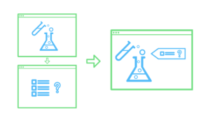
Ditching Highly Proprietary Design Patterns: Reducing the UX Threshold for Complex Administrative Tasks
It might be easy to improve on bad UX, but making good UX great requires complex problem-solving from your UX team.
In edTech, the administrative aspects of learning products often have the most technical complexity. By leveraging common UX patterns, you’ll lower your UX threshold and make your product something that meets teachers and students where they are.
Administrative complexity looks different depending on your primary user. For teachers, administrative complexity may involve setting up the software for the learning product, creating user profiles, rostering students, or managing multiple staff users. For administrators and IT professionals, it might mean navigating multiple screens, connecting to outside systems, or learning how to share data across platforms. And for parents, administrative complexity requires learning how to sign up their child as the product’s primary user. It might also mean taking advantage of available learning outcomes data in order to make informed decisions about their child’s education.
In order to lower the UX threshold for your product, leverage existing UX patterns that won’t require users to learn a new, proprietary system or go to multiple places to accomplish a simple task. Lowering your UX threshold encourages your user to engage with the task at hand, which leads to higher completion rates within your product. It also helps shift the user’s mindset from tense to relaxed. A tense user will tend to have a lower frustration threshold for completing tasks.
Even if you’re using well-established UX patterns, there’s plenty you can do to provide a fresh and delightful experience for your user. Micro copywriting, visual design, and other touches provide your experience with a unique look and feel without causing cognitive overload.
The more you can do to meet schools, teachers, and students where they are, the more relevant your designs will be. You’ll create learning products that solve problems and integrate with a teacher’s day-to-day technology. And you’ll design tools that enhance and extend what administrators are already using — all without adding complexity for your users.
Leveraging Interactive Complexity to Help Students Learn
In edTech, designing a product with interactive complexity becomes even more important. We have an obligation to consider how to make interactive teaching moments rather than static ones. We must strive to work with subject matter experts to determine how to break a topic down, so students work with material in a rich way.
Most learning products demand a high level of interactive complexity from UX designers. Ideally, students are able to learn new concepts or skills as they move through an experience and interact with it. However, this level of interactivity adds to a product’s UX complexity, and UX designers often remove interactivity from the moment of instruction or assessment — just when students need it most.
For example, a learning product with interactive science experiments might have two separate interfaces. In one interface, students are introduced to scientific concepts illustrated by the science experiments. In another, they might be encouraged to interact with the science experiment itself.
However, if you separate the interactive interface from the problem students are trying to solve, you’ll wind up creating a higher barrier to learning. You’ll design a cognitively disjointed experience, which isn’t how students experience learning in the real world. Students will end up learning how to use your product — instead of learning a new concept.
While it may seem counter-intuitive, leveraging interactive complexity actually requires you to simplify the UX for your product and reduce its UX threshold. The more you simplify your UX, the more likely you are to make a product that showcases important concepts and engages the students who need your product to learn.
The ROI of Investing in Great UX by Reducing Your UX Threshold
Even if you’re building a complex product, there’s real ROI to investing in UX. Not only do you help teachers, administrators, and parents onboard and navigate your product quickly, but you also improve learning for students by connecting new concepts and skills to interactive UX.
Concrete design requires both the administrative and interactive parts of a product to work together in concert, even when they’re individually complex. When you use an approach like concrete design, you make a product that’s more likely to be bought or adopted. Teachers and students respond to a product that’s easier and more fun to use, increasing overall engagement with your product.
You also reduce cognitive load within the product, which means less training time for teachers and less onboarding for students. While onboarding for any product is necessary, there are downsides to a long, drawn-out adoption process. If your onboarding strategy depends too heavily on textual explanations, for example, you introduce more barriers to students and teachers with learning differences.
When you reduce training and onboarding needs for your product, not only are you building a more equitable product, but you’re also shifting resource allocation within your budget. Suddenly, you don’t have to spend a large chunk of your project budget on designing onboarding tools. Instead, you’re able to focus those resources on developing product features and creating outstanding visual design.
When you build a tool that’s more intuitive to use, you directly impact your bottom line. Improving UX leads to more revenue streams as you widen your market and roll out a product that’s more accessible and easier to use. When you give potential clients a demonstration of your intuitive product, your sales team has to do less explaining — and the product begins to sell itself.
Why the edTech Industry Should Care About Making Good UX Even Better
Like you, we care about designing intuitive edTech products that solve real problems and are adopted widely by schools and school districts. But we also recognize that the edTech industry has different users and goals than consumer tech.
The stakes for edTech products are much higher. Good UX can be the difference between a student learning a new concept and struggling to master it. It can also mean the difference between a product that all students can use and a product that excludes students with learning disabilities.
Because the stakes for our products are so high, we have a moral obligation to identify the point at which bad UX creates barriers to success — and push ourselves to make good UX even better.
Download our free UX design toolkit to improve the UX of your edTech product!

Sean Oakes
Sean has over 20 years of interactive design and account management experience. In 2000, Sean founded SOS, a specialized creative studio based in Brooklyn, NY. He has set the creative vision for the highly regarded firm; the power of thoughtful design and delightful user experience to enable better teaching, learning, and communication.
Sean is a graduate of the Rhode Island School of Design. His work has been recognized by The Webby Awards, Communication Arts, SXSW Interactive, Business Week, The Smithsonian, and Apple.