Summer Programs

Overview
As part of our ongoing partnership with BellXcel -- a non-profit organization dedicated to supporting after school and summer programs for underserved communities -- Backpack worked to design and build an all-in-one tool to support their partners with a powerful new digital platform.
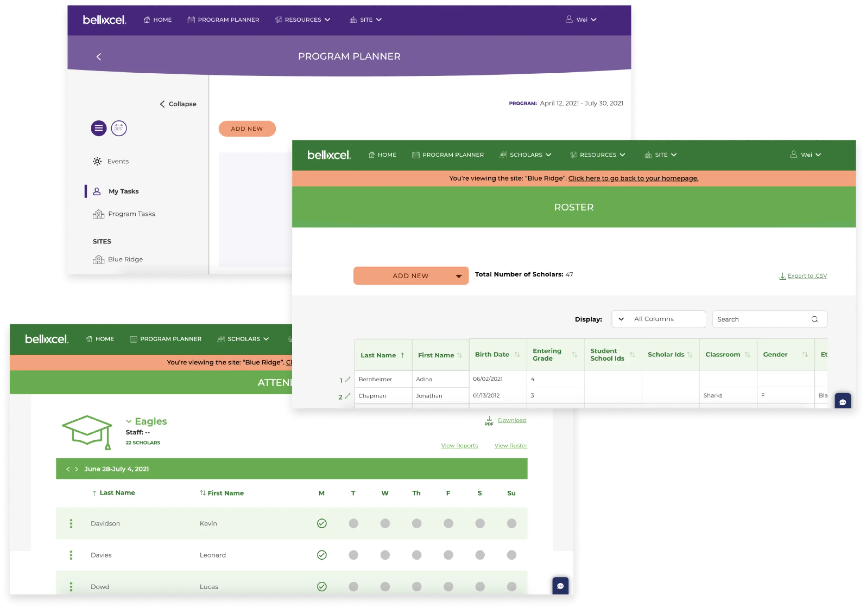
We set out to create a friendly, integrated online portal, combining the different parts of the user experience: creating a new program, managing a task list and team, keeping track of scholar and staff rosters, taking attendance, viewing data, and more.
With a tight-knit network of overseas developers and information architects, we created a powerful desktop and mobile web-based application from scratch in only 24 weeks -- and became an extension of the BellXcel team in the process.

What We Did
-
Research
-
Prototyping & Usability Testing
-
-
Strategy
-
Product Ideation
-
-
Design
-
Wireframes
-
UX Design
-
UI Design
-
Illustration & Animation
-

A Connected Pipeline
As part of Backpack’s continued commitment to support educational nonprofits, Backpack took a leadership role throughout development.
We led working sessions with the clients, and recommended new ideas beyond our initial scope in service of creating a better product. We also hosted user testing sessions, creating a script for receiving direct feedback on website builds. Working with a remote team of over 20 people, with different handoff requirements, kept our project coordinators on their toes — but our expanded team also gave us the flexibility to adapt and evolve the user experience as we received feedback.
A mutual trust and understanding is important to our process, so building a rapport with the BellXcel team was core to this project.

Easy-to-use Reports and Data

Built for the Scholar
Our focus from the start of this development was to build a product with the user’s needs at the forefront. To that end, we built the UX with the knowledge that multiple types of users would be using BellXcel at once:
- BellXcel admins
- Program admins
- Site admins
- Account admins
- Staff
All have different needs from the software, so various features are enabled or disabled for different users.
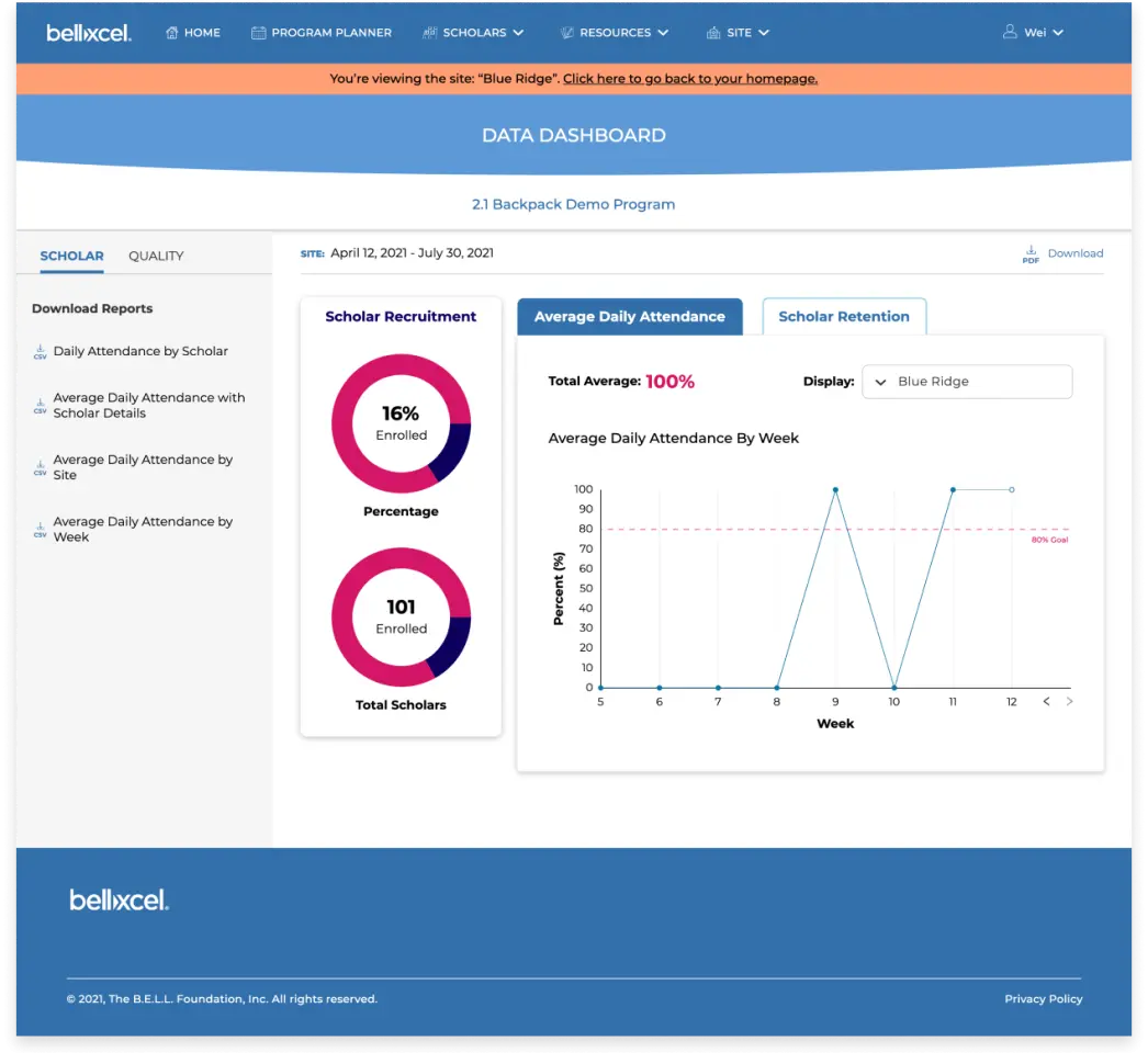
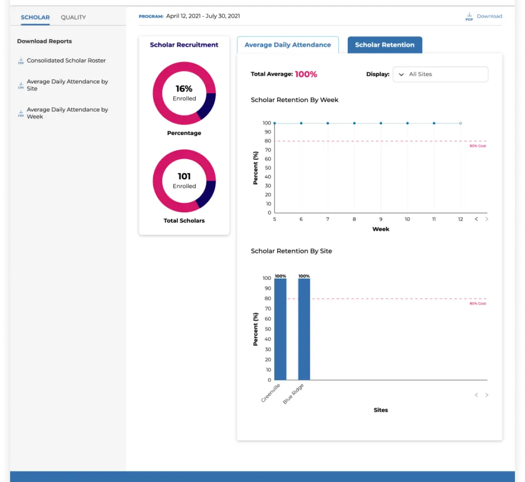
Take for instance the Data Dashboard, a core feature that allows staff to track attendance and communicate with their administrators. To better serve the teaching staff, we included a space to list reasons for absences — data patterns allow the staff to notice when multiple scholars are absent because of transportation, for instance, which allows them to personally reach out to guardians or work with public officials in that zone.
The UI itself makes this process easier as well. The designs are robust but welcoming. Animated illustrations accompany tasks, copy throughout is friendly and inclusive (using the term “guardian” rather than “parent,” as an example) — the user experience was developed to be not just intuitive, but fun.
BellXcel Moving Forward
We developed this program in Agile, which allows it to be iterative. As we continue to work with BellXcel on improving service, we can enhance features based on pilot testing within their company.
With a worldwide move to remote work over the past year, our second round of updates will integrate new methods of collaborations, with many more updates to come. BellXcel has been committed to keeping current, and our workflow allows us to update the designs to accommodate and support our users’ evolving needs.
Our partnership with BellXcel continues to grow stronger, and other design projects with their continued support are on the horizon.


Work with us!
Ready to get your project off on the right foot with an EdTech-specialized team?
Let's Talk
