Why User Flow Testing Matters—and When to Use It
We always want to know if the learning tools we design for teachers and students will work for them. Do they like it? Will it be useful? How would they integrate the tool into their learning experience or into their teaching?
These questions are central to qualitative user testing. But testing user flows is a little different. By conducting data-focused research on a prototype, you can determine whether users can complete tasks or how they get off track.
Data-driven user testing is also the perfect opportunity to test the assumptions behind your design decisions or your overall UX strategy. After all, edTech products aren’t meant for designers or product owners. They’re designed for your users: real educators and students who depend on your tool to make an impact on their classroom experience.
In addition to its benefits for your users, conducting user flow testing minimizes financial risk and helps you roll out a stronger learning tool. By collecting data and feedback ahead of your launch, you’re far less likely to design an edTech product that underperforms or garners negative reviews.
Instead, your design team can iterate based on user data and qualitative feedback. Integrate user flow testing into your design process, and you’ll never have to go back to square one again. We’ll even show you how to do it.
Let’s dive in!
What is User Flow Testing?
You’ve already dug deep into user research findings in discovery, created personas, and developed a solution. You’ve likely even interviewed teachers or students, describing product features and using their feedback to refine your ideas.
Once your qualitative interviews and rapid prototype tests are in the rearview mirror, it’s time to administer user flow testing to find data-driven answers about user interactions. This type of user testing is especially useful when your product has a highly transactional user flow with lots of interaction. For example, this might mean teachers are using your tool to organize a content sequence for learning or to build a new report.
A user flow test begins by putting a working prototype in front of your user. Based on their behaviors, you can determine where they get off track or where their decisions diverge from what you expected. With tools like heat mapping, you’ll also be able to discover whether users can complete tasks, and, if they can’t, which part of the user flow is causing challenges.
If your ultimate goal is to make a product’s UX so seamless that users are unaware of it, user flow testing is how you smooth out the details of an experience with finer and finer sandpaper. Plus, you’ll always get the data you need to back up your findings and fuel your next iteration!
Two Types of User Flow Testing
Moderated User Flow Tests & Heat Mapping
“Talk and click” tests, where you watch a user interact with a prototype in real time, are an optimal way to conduct user flow testing. By setting up a prototype with a heat map, you can observe where your user clicks.
During the session, you’ll also ask your user to sound out what they’re thinking as they interact with the experience. By listening to the user’s experience as you observe their interactions, you learn valuable insights about your user flow.
While “talk and click” user flow tests are preferable to unmoderated tests, they’re not always viable. It depends on where you are in the product development process—and how many users you need to test. Remember: you’ll want to test a decent number of users to get the most valuable data set, all of which requires prep time and meetings.
Because you want to measure how your product will work, you’ll also need to conduct the test late in the wireframe process. After all, you can’t put early work in front of 60 users without context—especially if you’re conducting virtual tests.
If you’re testing with young learners, you may still wish to have a moderator present in real time. Students don’t always interact with edTech products in a linear way, and they’ll respond to your questions more easily with additional guidance.
Young students, in particular, are very focused on how a wireframe looks. They’ll engage deeply with visual presentation—which might not be the feedback you’re looking for. A moderator can help these users stay focused on task completion during a user flow test. This way, you can be sure to collect the data you need to iterate successfully.
Virtual Task Completion
Testing edTech products has become infinitely more challenging during the pandemic. Thankfully, virtual task completion is a great option for user flow testing, and it’s easy to coordinate.
Services like usertesting.com help you reach potential users and build the data set you need to make improvements to your learning tool. Because virtual tests are easy to complete quickly and asynchronously, they lessen the demand on educators’ time.
They can be easier to schedule for learners, too. Remember: students often need the help of their busy parents to complete something like a user test. If you’re trying to test and validate quickly, virtual task completion is a win-win for everyone.
After sending your users a prototype, grab a screen recording as they accomplish tasks in your learning tool. In addition to creating a baseline for task completion, you’ll be able to clearly identify where and why users faltered.
While you may have to guess about what’s not working, your new user baseline helps you to iterate different solutions. You can even test again with the same user group to see if you’ve refined your learning tool successfully.
A 5-Step Road Map for User Flow Testing
User flow testing is a specific stage of user testing, and it sometimes requires additional buy-in from your stakeholders.
Below, we’ve mapped out a five-step road map for integrating user flow testing into your current process. In general, you’ll start with more qualitative methods, like user interviews, and progress to more data-driven tools like user flow testing.
- Conduct qualitative user interviews. Hold these early feedback sessions with your users by sharing UX wireframes for discussion.
- Build a clickable prototype and conduct user flow testing. Once you have a detailed prototype or wireframe, you’ll be able to set up a moderated or unmoderated task completion session.
- Address feedback that came up in earlier testing sessions. Use the qualitative and quantitative data you’ve collected to address user feedback and suggestions.
- Test out the look and feel of your learning tool. With more detailed, high-fidelity wireframes, you can also collect user feedback on the look and feel of your edTech product. This is often the best time to test with young learners, who respond most easily to nearly finished design work.
- Compare user testing data with real-world data. After you release your learning tool into the wild, you’ll be able to collect an even bigger set of data with active users. Have you accurately addressed the problem? Are your users still coming up against the same challenges? By comparing user testing data with real-world data, you’ll be able to more effectively address issues of usability.
This road map works well with shorter timelines. Large-scale projects might need as many as 3 to 4 user touchpoints to gather enough data for improvements. It’s not uncommon to repeat or refine steps along the way, either. Ultimately, the goal of testing is to refine your product—and to eliminate business risks by identifying the best solutions for your users.
3 Tools to Use for Your Next User Flow Test
New to user flow testing? We recommend the following free or low-cost tools to get started with a professional polish.
- Hotjar (https://www.hotjar.com/). Install this heat mapping tool on live products or websites to track user behavior.
- Maze (https://maze.co/). Use this tool to send your user groups a clickable prototype. You can break up a prototype screen into individual tasks for your users, or provide moderation and context for your user groups, which is ideal for user flow testing. Maze also allows you to record everything your user does, providing a very scripted experience for the user. Once they complete a task, the software poses multiple choice or open-ended questions so you can receive additional qualitative feedback
- UserTesting (usertesting.com). Create a demographic profile for your ideal users, and this service will recruit users that match your requirements. In the specialized world of edTech, you can’t always guarantee you’ll get the right users using a service like this, so it’s best to opt for volume. Ultimately, cultivating a list of your own users from your newsletter subscribers or other contacts invested in your brand will work best for user flow testing.
How to Ask Better Questions During Your User Tests
Everyone wants to verify that they’ve made the right design decisions for a complicated feature. But without strategically narrowing your testing questions, you won’t get the information from users that can most help you.
As you come up with the script for your user flow test, identify the actionable steps you’d like to prioritize. If you’re later in the design process, identify which actions are high priority. What’s fixable? What can you do now? What will you have time to do later?
Sometimes you won’t have time or budget to test frequently so you can iterate along the way. If that’s the case, you can always test users right before you hand off the product to your dev team. This way, you can identify priority fixes for a phase two roll-out. Remember: it’s always better to do some testing, rather than none at all.
How User Flow Testing Accelerated Feature Enhancements for BellXcel’s Program Planner Feature
As part of our ongoing partnership with BellXcel — a non-profit organization dedicated to supporting after school and summer programs for underserved communities — Backpack designed and built an all-in-one digital platform where users can manage their programs.
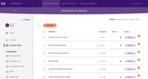
Early in the design process, we tested BellXcel’s “Program Planner” feature with educators using a high-fidelity prototype. The Program Planner was designed to help users view and organize upcoming and completed tasks and events, as well as create personal task reminders.
In order to make task management especially easy for new users, the Program Planner came pre-filled with recommended tasks. These tasks even came with date assignments and recommendations. For example, if a user created an account today, the Program Planner would already contain a task like “review last year’s reports” with a recommended 1-week deadline.
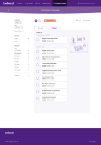
During user flow testing, our first goal was to establish a baseline of understanding about navigation and feature interactions. We wanted to know whether program staff members easily understood what each button in the Program Planner did and how they might navigate through the feature. Because the Program Planner was designed to help staff members manage their tasks, we also tested whether they could easily add a new task on their own.
But we were also looking for more qualitative information, so we moderated the BellXcel test. In order to develop a clearer picture of how a user might incorporate the Program Planner into their-day-to-day, we asked how useful the feature would be for both new and experienced users.
In the end, these questions were crucial. We initially assumed that even experienced users would quickly adopt the Program Planner. By asking about users’ likeliness to adopt the feature, we learned that new users would benefit most from a feature like the Program Planner and be more willing to use the product.
Users with more experience, however, would likely find more value in later iterations, which would include integrations with Google Calendar and the planning tools they had adopted before the development of the BellXcel platform.
Our user flow tests for BellXcel illuminated issues of usability and adoptability, while also helping us to establish our UI. Because the Program Planner was such a large feature, visual design decisions made for the Program Planner affected other parts of the platform. With detailed feedback from users, we were able to move forward quickly with feature enhancements and additional features in the platform, too.
Why User Flow Tests Matter for Complex edTech Features
As our results with BellXcel demonstrate, it’s especially important to test complex interactions like planning and task management features. Putting together a pipeline of tasks for classroom, program, or curricular management is often the first real interaction a user has with your product. After all, tasks and to-dos make your product usable.
To design the first iteration of any feature, you’ll make many assumptions about what is most important for your persona—just like we did. Without testing these assumptions on real users, however, you run the risk of making a central feature less likely to be widely adopted. And if educators are unlikely to integrate a new tool into their existing tech stack, they’ll never unlock the full value of your product.
Whether you’re collecting data for a new user baseline or incorporating feedback into an iterative design process, user flow testing validates your design decisions and mitigates risk. With a clearer picture of how your features hold up against user expectations, you can make improvements on the fly, launch a stronger edTech product, and make a real impact on your users.
Are you ready to test a prototype with your users? Contact us below to find out more about our UXR services!

Sean Oakes
Sean has over 20 years of interactive design and account management experience. In 2000, Sean founded SOS, a specialized creative studio based in Brooklyn, NY. He has set the creative vision for the highly regarded firm; the power of thoughtful design and delightful user experience to enable better teaching, learning, and communication.
Sean is a graduate of the Rhode Island School of Design. His work has been recognized by The Webby Awards, Communication Arts, SXSW Interactive, Business Week, The Smithsonian, and Apple.


