
7 Telltale Signs of a Messy edTech Product Suite & How to Fix Them
As companies merge, their suite of edTech products evolves. New learning tools—all built at different times—become available, while others drop away.
If you’ve grown quickly as a company, you might notice that the learning tools you’re managing have:
- Inconsistent UX/UI patterns
- Unique philosophical or instructional approaches
- Different learner data stories or reporting measures
- Incompatible sales or subscription models
Needless to say, these sudden changes to your product suite aren’t always pretty—or user-friendly!
Sound familiar?
Below, we’ve identified seven signs your growing suite of products needs a little TLC—and how you can fix each challenge with user experience research and design.
1. Your products are showing their age
Aging edTech products fall into a few different problem categories. Here are three scenarios I see clients face time and again:
- Scenario 1: You have cutting-edge learning content, but important, new technology has outpaced you in the time it took for core content to be written, vetted, and tested.
- Scenario 2: You have an elaborate, student-friendly UI, including a wide range of avatars, characters, and digital worlds. What felt on-trend when you started designing is now out of date.
- Scenario 3: Your product is still selling well, but competitors are doing a better job. There are likely other indicators you need to make design or functional fixes, too, including lagging user engagement.
Regardless of which scenario you find yourself in, most aging edTech products can be improved by conducting user experience research, smoothing out your design process, and aligning your design and content teams.
The fix?
Before you dive into user interface (UI) updates, take a moment to step back and assess.
As you look across your entire edTech product suite, consider each learning tool in its current state by conducting user experience research. After all, if your product is a few years old, your user experience research is now out of date.
With research under your belt, assess the products internally. Conduct exercises to look at them with fresh eyes, so you can identify creative solutions for your user experience needs.
If your research and internal work all point to improving your learning content, develop wireframes and core user experience first. This will give your entire team a foundation for collaborating on learning content together and help you come up with the best content ideas.
Collaborating on wireframes also supports the needs of your content team. These experts require a strong understanding of templates and user flows before they can test learning content in prototypes.
Once your content team is able to iterate using templated designs, your design team can work on UI fixes, bringing aging characters or sequences back into alignment with the product as a whole.
2. You’ve invested heavily in feature development
We get it—everyone wants incredible features that draw users to their learning tool and keep them coming back again and again.
But it’s possible to over invest in feature development at the expense of ironing out the core functionality of your product.
For example, prioritizing fancy, AI-powered search sounds great in theory. However, if your product UX and information architecture are structured to help users easily access what they need, a powerful search experience might not even be necessary.
Overall, it’s often a better use of your time and resources to think deeply about information architecture first. Then, structure your product for user journeys accordingly.
If you start going down the path of adding features willy-nilly, it’s all too easy to abandon user needs and tasks.
The fix?
In order to address feature bloat across an entire edTech product suite, you need several fixes: a more holistic approach to design, a thoughtful design system, and stronger design governance.
Embracing a holistic approach to design
When you look holistically at your experience needs across individual edTech products, you should start to see commonalities in user needs and tasks.
Once you identify the features your products could share—or already do—it’s easier to build recognizable, repeatable, and predictable user experiences.
Remember: the same user who depends on your vocabulary and literacy product is often already using your math products, too.
But if you’re investing in wildly different features for each edTech product, you can’t take advantage of the fact that your users have already learned one tool—and they can use all your other tools the same way.
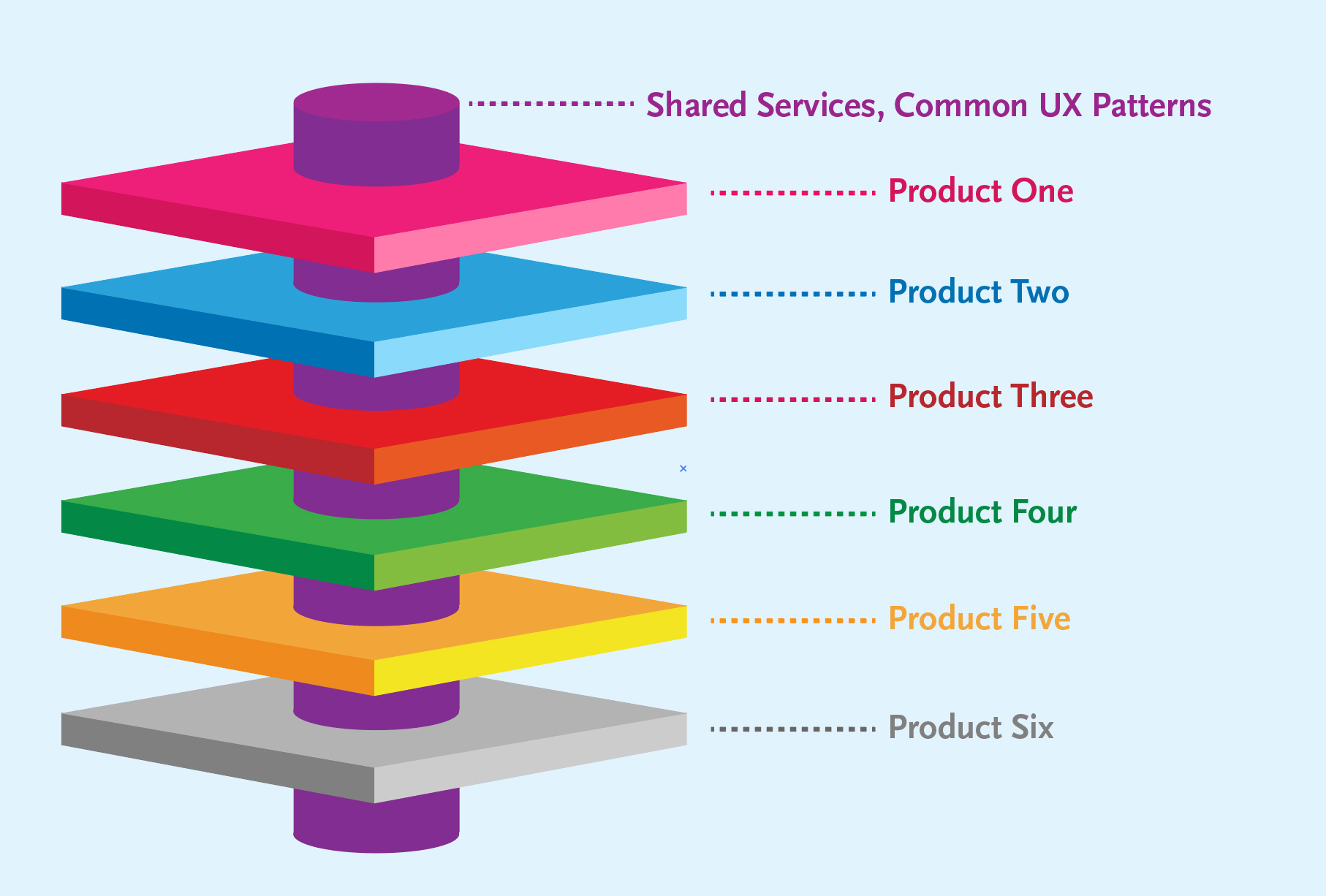
Implementing a design system
Design systems create better user experience across all products.
When you unify your system, you can often cut down on your front-end development budget in the long term. At minimum, this requires identifying:
- Which elements to share across all of your products, like navigation or reporting
- Which elements should stay unique from product to product, like a science experiment simulation or a reading log
However, sometimes the push for global solutions is a shoehorn fix. After all, there are reasons you have different products in your suite!
From product to product, there are likely specific user needs for learning content, or specific needs based on each product’s user base. These must all be accounted for, even as you push to unify your design system.
Begin by talking to your content team about why the learning content in each product is sequenced differently. If you do need to unify disparate products in your suite, what’s the best path to bring all of your users along with you?
Committing to governance
If your organization doesn’t have a documented way to identify, prioritize, and weigh the need for new features, a messy edTech product suite is all but inevitable.
As part of your governance plan, your design team should have good reasons for when you need to do things differently within a product, like integrating new components.
New features that grow out of real user needs and expectations are more likely to succeed. Otherwise, it’s more efficient to leverage a user’s existing mental model of a feature or task.
Once you figure out when a new edTech feature should have new components—and when it shouldn’t—build your product road map from there.
3. You have a lot of UX debt
Like technology debt, UX debt in edTech accumulates when you have
- Disparate UX/UI patterns for each tool’s philosophical and instructional approach
- Products with different learner data stories or reporting measures
- Multiple learning tools with a haphazard approach to accessibility
- Unique sales or subscription models that don’t work together
When each of these things is too different, users can easily become confused. Or, worse—they may even be forced to troubleshoot on their own by cobbling different products and experiences together.
The fix?
We’re not going to lie—this can be a tough one.
UX debt is different at every organization—and budget plays a large role in how you’re able to address this issue. Some common origins of UX debt include:
- Organizational budget constraints
- Prioritizing technology or content issues over user experience needs
- Products that are neglected because other learning tools drive revenue
- Products that are misaligned with your organizational mission
- Leadership turnover has created confusion at the organizational or team levels
No matter the reason for UX debt, there are a range of budget-appropriate fixes to try.
Small-Budget Fixes
Only have the budget and team to make small fixes with a big impact? That’s okay—just find low-hanging fruit.
Typically this means refreshing the user interface design across your edTech product suite, so there’s more consistency.
Lack of visual consistency creates trust issues with users—and your problems will compound from there.
Medium-Budget Fixes
With a little more budget, you can conduct the right amount of user experience research to establish priorities. (You can also prioritize budget in your assessment!)
Listen to users and mesh their observations and needs with the needs of your business. By working backward from foundational usability, you’ll find the valuable, unique features that teachers and learners look for in edTech products.
After all, if you don’t have foundational features, no one can use your learning tool.
And if you haven’t designed enough high-value features, you won’t stand out in a competitive marketplace.
User research is the ticket out of this frustrating cycle.
Large-Budget Fixes
If you have plenty of room in the budget, start with our medium-budget fixes and build out from there.
Conduct additional user experience research and outline the trends to identify your design priorities.
Don’t forget to take into consideration what your internal customer service teams have said, tying their observations to documented business needs.
Once you’ve collected all your research findings, run a workshop with your team.
Together, you can consider the evidence, build consensus, and identify priorities for bringing all of your edTech products into closer alignment with one another.
4. You invested in customer success rather than UX
Customer success teams are indispensable. Like sales teams, they hold vast amounts of knowledge about common user needs and challenges.
But if you over-invest in customer success and under-invest in product design, you risk creating a culture of customer experience instead of building a better product from the start.
Your customer team is most likely providing repeated support for users who struggle with basic product functionality.
Instead of spending all of your company’s time trying to support confused users, it’s time to address the building blocks of your tool: administrative features.
The fix?
When I’m asked to diagnose challenges in edTech product design, I often start by talking to customer experience teams. More than anyone else, customer experience understands the challenges your users face every day.
For every 10 edTech users who contact your support team because they struggle with basic administrative features, there are many others who give up, don’t bother, or who simply won’t use that feature.
More often than not, conversations with customer teams reveal that users are experiencing challenges with fundamental aspects of the experience—not just advanced, or more complex, features.
Across any suite of products, there are shared administrative tasks. This might extend to features as complex as data analytics and reporting, or as fundamental as student onboarding or resetting passwords.
Especially when large organizations have many shared services, they’ve likely stitched together several existing technologies, like an off-the-shelf reporting solution in a custom learning tool.
This results in different navigation systems across or within individual edTech products, and a user experience that simply hasn’t been smoothed out yet.
There’s nothing wrong with using a plug-and-play solution to get to MVP. But you may have unintentionally created cognitive dissonance for your users, who now have to accomplish the same task in a new way for each product in your suite.
As your product suite grows, you’ll need to find ways to smooth out the UX of shared services, like global navigation, sign-in, reporting, and more.
5. Your market fit keeps shifting
Even in an industry as slow-moving as education can be, product teams must navigate regular fluctuations in market fit.
For example, the preferred pedagogy for a specific subject might change, which directly impacts your content or editorial team.Or maybe you went all-in on a technology trend that now seems to have fallen out of favor.
Now we’re all talking about how to use AI to support teachers, but just a few years ago, product teams were focused on integrating project-based learning approaches into their learning tools.
While any edTech company needs to be flexible enough to address market fluctuations around trends in pedagogy or technology, sometimes it’s clear that your approach just isn’t working.
Sales teams experience challenges talking to administrators. Customers aren’t renewing, or your users only gravitate to pieces of the product—leaving other features to gather dust. Engagement drops off.
It’s time to re-evaluate.
The fix?
This is another challenge that requires product teams and company stakeholders to take a step back.
Are you going to keep investing in features that your users don’t need? Maybe your product shouldn’t have 20 types of data reports because they don’t meet user pain points—not because your reporting feature needs more engineering.
This process of evaluation is especially important if your edTech product has been on the market for a few years. States change their accessibility or language requirements over time, while users’ pain points can always shift.
In addition to market and user research, evaluate the features of your learning tool that will withstand the test of time—and technology trends.
Designing edTech for the long term is a tried and true strategy, whether your learning tools focus on a single subject or support the professional development needs of teachers.
If you’ve designed a subject-based product, what are the fundamental elements about teaching that subject that will never change?
Or, if you’ve designed a teacher-centered tool, what are specific ways technology can support teachers more effectively, and at scale?
The more you can consider why your product accomplishes something important for teachers, rather than fixating on the specific solutions, the less apt you are to be caught off guard by trends.
Instead, you’ll have created a learning tool that’s engaging for students and meaningful for teachers. And, most likely, you’ll have found more sales opportunities by staying on top of trends—and user research.
6. You’ve rolled out small fixes that resulted in bigger messes
Hey, it happens! We all want to make user-centered design decisions, especially for the teachers and learners who use our products.
However, it’s possible to make decisions that support what a handful of specific users want without serving your larger business needs or goals.
Customers have a funny habit of telling you what they need—not what their problem is. Your team’s job is to solve UX problems—not simply fulfill needs. See the difference?
If not properly assessed, new feature requests, improvements, and other kinds of UX solutions can actually cause the UX of your entire edTech product suite to suffer.
This is especially true if you’ve attempted to solve a small design problem not knowing that it was actually a symptom of a much bigger issue.
The result? Feature bloat, complicated workflows, and more clutter.
The fix?
All product teams need a way to identify user problems accurately, even if that means getting input from other stakeholders at your organization.
This might include your sales team or customer reps, who often have detailed or documented anecdotal evidence. From there, you can prioritize and test solutions.
Build a moment of reflection into this process, too. Ask yourself, “Is this a small fix? Or a symptom of a bigger problem that needs to be addressed?”
Pro tip: If you’re recognizing patterns in user behavior or receiving the same types of customer complaints, it’s usually time to take a step back and look at the bigger picture.
Don’t be afraid to make a bigger change to your experience once you’ve accurately identified the problem.
Teachers and learners already anticipate that technology will evolve and improve, and they expect to learn new pieces of UX.
There are also great ways to support users as they adjust to these new changes, including onboarding and point-of-need help.
7. Your internal teams are constantly moving between products
As teams and companies grow, you might find yourself with a development or other internal team that moves quickly between products in your portfolio.
In a field as specialized as edTech, this results in team members who may not know everything they need to be successful engineers or other leaders on this particular learning tool.
Switching between a math and reading product designed by the same company sounds easy in theory.
But in practice? There’s usually a host of internal knowledge and governance teams must learn to design cohesively.
The fix?
The best way to fix this issue is with a word no one really likes but everyone needs: governance.
After all, without governance, your teams will always be forced to rely on the expertise of a specific team member.
To make sure everyone has the tools they need, establish your governance rules around:
- How features are designed from start to finish
- Who owns content and design
- How design is prioritized—and whether it aligns with your company’s overall mission, vision, or “spark”
This will prevent the siloing of specialized knowledge and overly bespoke UX solutions.
Messy edTech product suites emerge for all sorts of reasons—not least because of the rapid change and growth we’ve seen in our industry over the last decade.
Thankfully, each of these common problems also has a common set of solutions.
With thoughtful stakeholder evaluation, user experience research, and a holistic approach to design and design systems, you can lead your product team to create a better suite of learning tools for your users.
When you eliminate user confusion, address real pain points, and future-proof your technology, you’ll set users—and your business model—up for success.
Do you need help cleaning up your edTech product suite? User experience research and thoughtful user experience design are your first steps to creating a better UX across each of your products. Contact us below to learn more!
