Accessibility and Inclusion in edTech UX Design
Inclusive design draws on the experiences of people from many different backgrounds to make products stronger for every teacher or learner.
On the surface, this may look like choosing more inclusive animations and illustrations in your user interface.
In reality, accessibility and inclusion in UX design extends to every part of the product design process in edTech. When we design with this intention in mind, we make edTech products more accessible.
From product planning to user recruitment, here’s how to ensure your learning tools are built using accessible and inclusive UX design standards.
What Does Accessibility and Inclusion Look Like in edTech UX Design?
Discussing accessibility and inclusion in the edTech product world can be confusing. Many of these terms are used interchangeably—and they’re also very closely related!
Here’s a quick break down of what each term means and how they apply to learning tools:
- Accessible design. With an accessible design mindset, you specifically consider the needs of edTech users with disabilities. This could range from providing assistive technologies, like closed captioning or screen reading capabilities, to meeting baseline accessibility benchmarks.
- Universal design (UDL). One way to ensure that you’re always designing accessible learning tools is to adopt a framework like universal design, or UDL.
UDL principles will help you design edTech products for users with all needs—including teachers or learners who might require specific accommodations. By designing with a wide range of user needs in mind, you’ll improve the user experience for everyone who encounters your learning tool.
- Inclusive design. By adopting an inclusive design mindset, designers consider the impact their product will have on a diverse group of people. This affects everything from representations of people and environments within your product to considering how users will interact physically with your tool.
In order for edTech products to be successful, they have to work for as many different people as possible. This means addressing both accessibility and representation effectively in our learning tools.
In the U.S. alone, there are many different regional understandings of educational concepts or UX patterns, and this becomes more complex as you design tools for English Language Learners or across state standards.
After years of adopting accessible edTech design frameworks, I’ve come to believe that prioritizing accessibility is a way to be more inclusive—and vice versa.
When designers engage with a wider set of people through user testing, they will naturally come into contact with users who have vastly different needs. This process opens up more opportunities for solving problems creatively—and for making our products accessible and inclusive for as many users as possible.
After years of adopting accessible edTech design frameworks, I’ve come to believe that prioritizing accessibility is a way to be more inclusive—and vice versa.
How to Make Your edTech UX Research Process More Accessible and Inclusive
Once you know how accessibility and inclusion affects user experience, it’s easy to find ways to incorporate this mindset into every aspect of product planning.
Here’s how to make each step of your user experience research process more inclusive, from recruitment to competitive analysis:
User recruitment
When it’s time to test your learning tool, the way you approach, interview, and observe your users is fundamental to designing an accessible and inclusive product. Here are a few recruitment tips to keep in mind:
- Extend your timeline. Recruiting for accessibility testing can take more time. Make sure you’re seeking out users who can truly understand and speak to an issue in the product impacted by accessibility needs. This is especially true if you’re working on a product that supports specific learning needs or abilities, like a reading tool for dyslexic learners.
- Interact thoughtfully and intentionally. Some users may prefer text-to-type options or email instead of a live call. Be ready, willing, and able to accommodate user preferences to ensure their perspectives are included.
- Make it easy to participate. Whether you test outside of normal business hours or offer asynchronous options, eliminate as many barriers as possible to user testing
Interview & survey methodology
User experience researchers and product teams should also anticipate shifting their interview or survey methodologies to accommodate different types of users. This will ensure that your user research findings apply to edTech users with a wide range of needs.
Here are a few ideas we use in our own UX research:
- Sending simple surveys. If someone isn’t comfortable speaking in English, for example, you might send a simplified survey or work in translation.
- Offering multiple forms of response. Phone or video interviews don’t work for everyone. Give users options for how they respond, including written responses.
- Providing asynchronous prototype or concept testing. Asynchronous testing allows users to take their time and perform tests comfortably in their own environments.
- Fairly compensating participants for their time. Be mindful of the time commitment you’re asking users to undertake. Recognize that a user test or interview may require one user more time than another.
Ultimately, offering users a variety of options will help you interview or test a wide array of users. This way, you’ll get the fullest possible picture of how your learning tool addresses their needs.
Competitive analysis
Competitive research is a great place to expand your product team’s ideas about what accessibility and inclusion look like in UX design. Here are a few places to start during your next competitive audit:
- Examine edTech competitors through the lens of accessibility and inclusion. Are the illustrations in these tools representative of many different kinds of people? Are their language choices inclusive? Identify accessibility and inclusion benchmarks for edTech and analyze competitors accordingly.
- Include competitors from different industries. This is a great way to expose your entire product team to innovative best practices and the newest ways to incorporate accessible technology into digital products. Rather than simply being in compliance with a specific standard, you can shift your team’s thinking about accessible design.
- Conduct an accessibility audit. In addition to conducting a competitive audit through the lens of accessibility, work with your engineering team to conduct a technical accessibility audit. Taken together, the findings from both of these audits offer powerful recommendations for improving your learning tool’s experience.
Product planning
Complex features regularly get de-scoped or de-emphasized during the product planning process. That means it’s up to designers to champion the findings from user interviews that will make their learning tools more accessible and inclusive.
Remember: designing for accessibility and inclusion makes the user experience better for everyone. It’s worth it to prioritize the features you know will be most helpful for the teachers and learners who use your product.
If you need to compromise, hone in on the most important feature to design. This should be verified by user research and make a specific improvement in your learning tool. Don’t be afraid to reference user research findings or audits to advocate for this priority.
You might not be able to incorporate all of the accessible features you identified in your minimum viable product. But designing the most important feature will ensure the product’s success and speed the road to adoption!
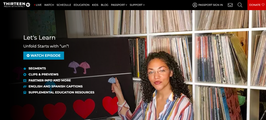
How Accessible and Inclusive UX Research Practices Helped WNET Support Parents During Remote Learning
During COVID lock downs, public media station WNET created video content to help teachers support students with remote learning. Some videos were created specifically for English Language Learners, while others were specific to literacy topics like phonics.
They asked Backpack Interactive to conduct user interviews and UX research to determine whether they should market this content to students or to families. Were families interested in navigating the site or supporting their students with remote learning content? Or would it be easier for students to use the site themselves?
Our approach to conducting user research ensured that we answered the question of audience in the most inclusive way possible. By adopting an inclusive mindset throughout the recruitment and user interview process, we were ultimately able to provide recommendations for user experience that supported the needs of all users.

Recruiting users
In order to confirm that WNET was solving for the right user, we wanted to talk to as many parents as possible who had children in the right age group. WNET’s videos were designed for early learners, including students with specific needs, like learning delays.
This meant we had to recruit parents:
- With children in the right age group
- With children who had specific learning needs
- With children who needed the video content, due to missing pre-K or Kindergarten instruction during the pandemic
Interviewing users in an inclusive way
During interviews, we wanted to assess how parents would find a resource on the site to use at home. We learned a lot about parents’ search habits—and how easy it was for parents to be frustrated by not finding what they wanted.
To ensure that we conducted interviews in an inclusive way, we:
- Adopted a flexible approach to call timing. Between time differences and work commitments, it wasn’t always possible for parents to answer questions during work hours. By staying flexible and scheduling calls during the evenings, we received crucial feedback.
- Made accommodations for second-language speakers. For many parents, English was a second language. We offered them multiple ways to participate in the interviews, including providing written responses and answering simple survey questions.
- Welcomed children to the interviews. Many parents brought students to the interviews, and we got lots of real-time feedback from the students themselves. They commented on everything from video length to visuals!
Prioritizing inclusion in our final recommendations
After creating personas to reflect the user needs that emerged during our interviews, we developed recommendations for WENT’s site. These recommendations prioritized accessibility and inclusive design, including:
- Designing for the parent persona. Because they’re not typically an edTech buyer, parents’ needs aren’t always considered during product design. We needed to change that for WNET.
- Adopting an accessibility end goal. Unlike teachers who use edTech day-to-day, parents have a high frustration level with educational technology. You can lose them after one failed search attempt! By prioritizing access as the end goal of the design, we could reduce the number of clicks parents made to identify learning content.
- Grouping content and site organization. Grouping content differently made it easier for parents to navigate the site and find videos for their children.
- Using plain language. Rather than use pedagogical terms to tag video content, we recommended developing a new taxonomy with simpler, more accessible language.
- Allowing for browsing and searching. Including grade levels and student skills in metadata made it easier for parents to search common terms and find the right content more quickly.
Designing accessible and inclusive user experiences in edTech isn’t just about hitting certain benchmarks. It’s a design mindset that will improve your learning tool for all the teachers and students who depend on it in the classroom. Simple changes to your UX research methods mean big wins for accessibility during UX strategy and design phases—and even bigger wins for your users.
Do your edTech products support everyone’s needs? Contact us below to find out how better UX research and testing can lead to more inclusive learning tools.

Monica Sherwood
Prior to entering the UX field, Monica was a special educator at public schools in Brooklyn and Manhattan. Her experience as a teacher has allowed her to develop a deep appreciation for research, and the ability to empathize with the unique needs of every user. She is also a strong advocate for inclusion and accessibility in design.
Monica obtained her undergraduate degree at NYU’s School of Individualized Study, and her Masters in Special Education at Hunter College. In her free time, she enjoys traveling, painting, and reading.


