Branding & Website
The Challenge
Balancing Play with Purpose
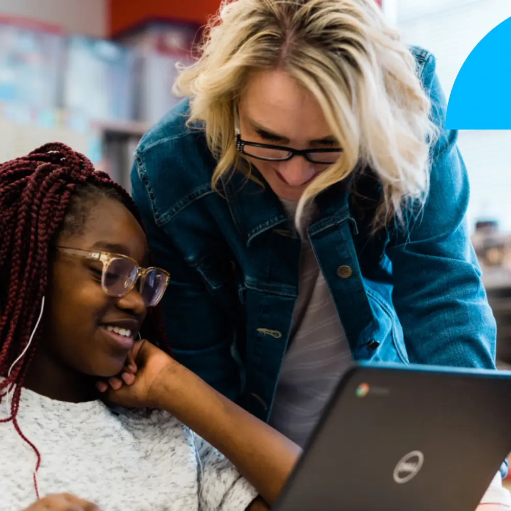
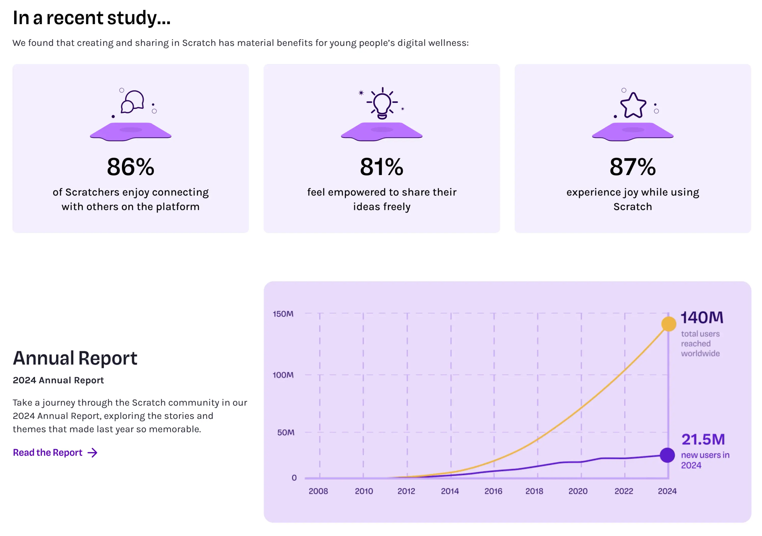
Over 140 million children worldwide have used Scratch to build games, animations, and interactive stories. Born out of MIT, Scratch is a nonprofit that has created a creative play space for a global community of kids, educators, and families who might never have been interested in a traditional programming platform.
Scratch’s challenge was to create clear pathways for its audiences with very different expectations — from eight-year-olds building their first animation to major donors funding its global mission. As content accumulated and the ecosystem expanded, the digital experience struggled to guide each audience clearly.
Rather than creating three sites to address the complexity (and fragmenting the experience), Backpack consolidated the website into a single, cohesive platform that could speak to kids, teachers, parents, and funders while preserving the playful, creative spirit that makes Scratch feel like Scratch.
What We Did
-
Research
-
Prototyping & Usability Testing
-
UX Research
-
-
Design
-
UX Design
-
UI Design
-
Accessibility Compliance
-
Design Systems
-
Our Approach
Finding Fun in the Framework
Backpack’s work with Scratch started well before the redesign with a thorough research project. We conducted a UX audit, surveyed learners and educators, interviewed stakeholders, and analyzed site data to understand where users experienced friction. The findings were consistent: users couldn’t find what they needed.
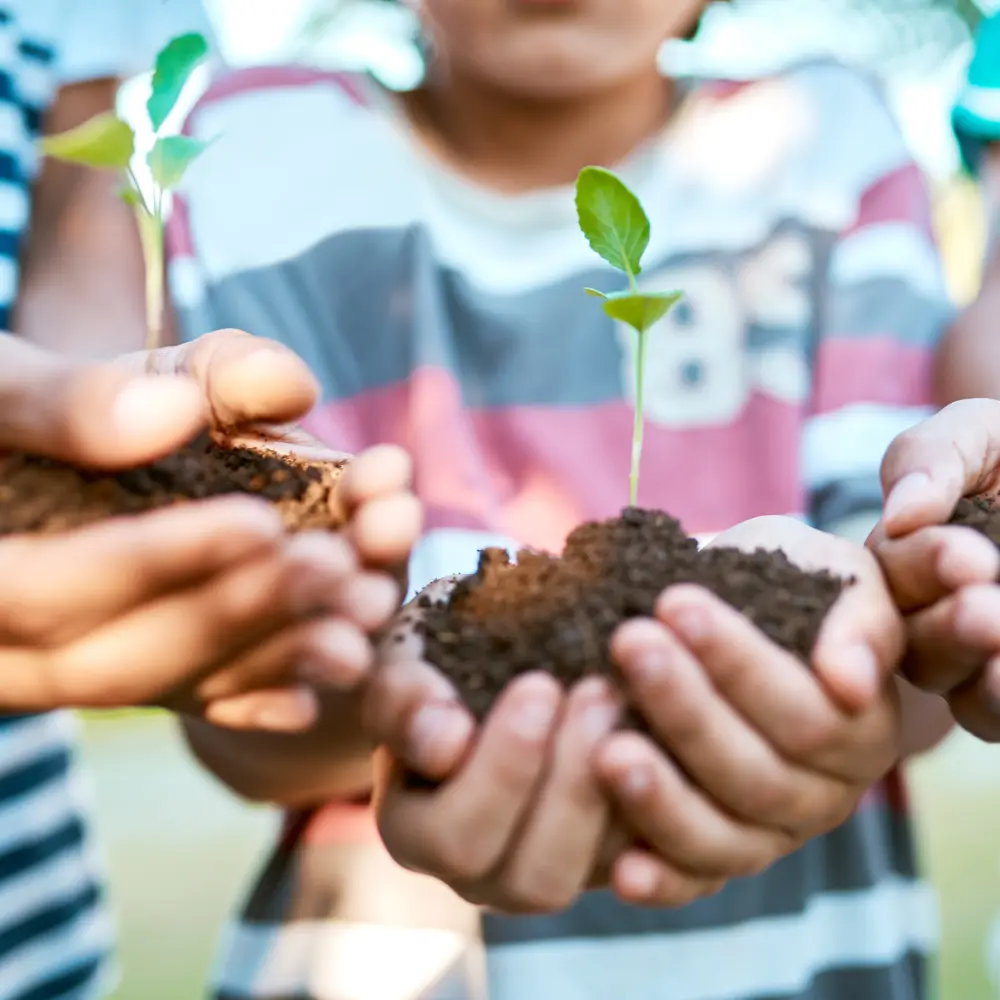
The research confirmed what years of working in education have taught us: even the most serious adult decision-makers want to see the spirit of childhood preserved in the tools they support. A teacher who works with first graders still expects to see the spirit of those kids reflected in the platforms they use. A donor wants to feel the creativity behind what they're funding. We dug into the story Scratch’s leadership needed to tell and the culture of creative learning at the heart of the organization.
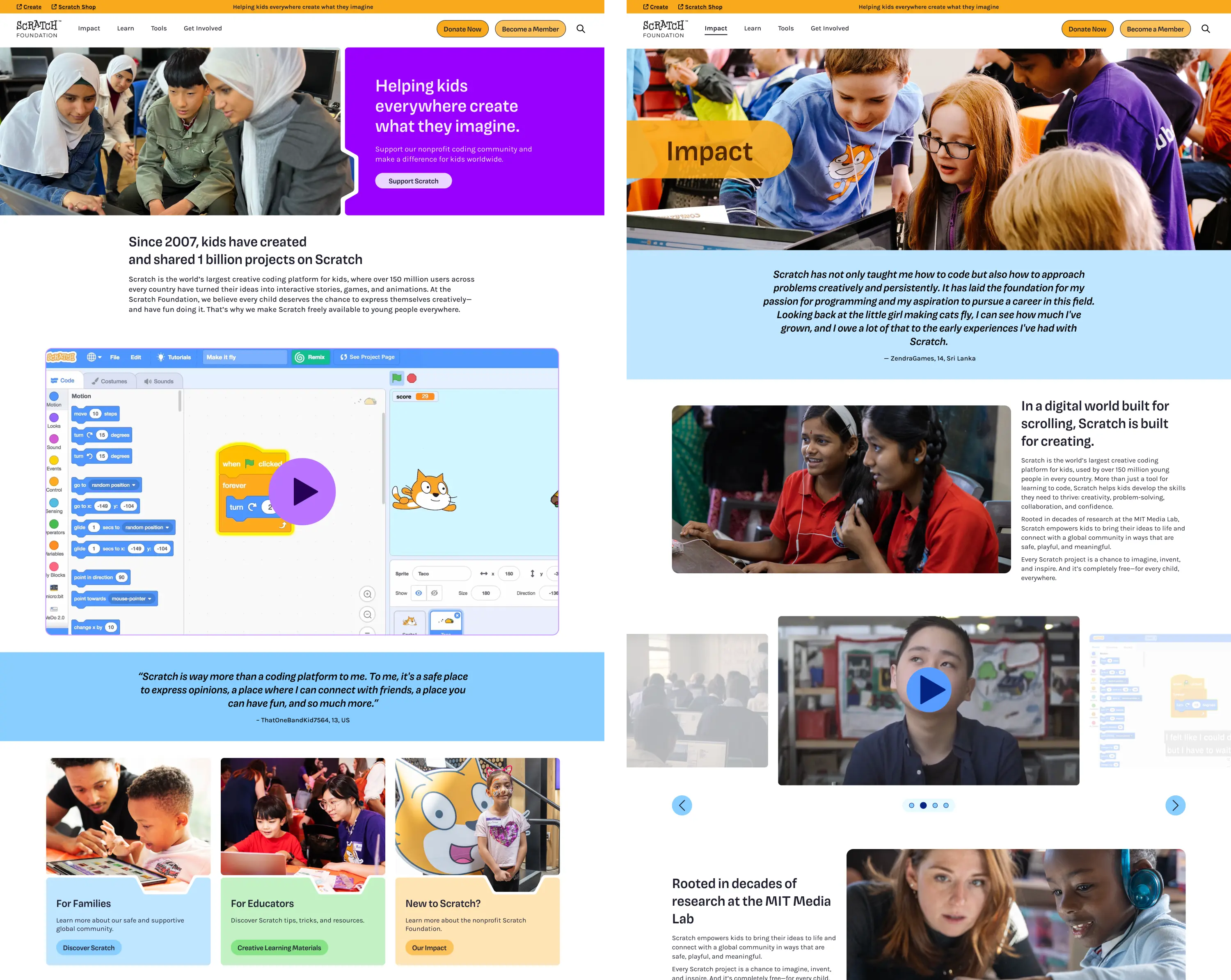
We started by overhauling the information architecture. Rather than expanding the navigation, we simplified it — consolidating multiple properties into a single platform with clearer entry points for educators, families, and supporters.
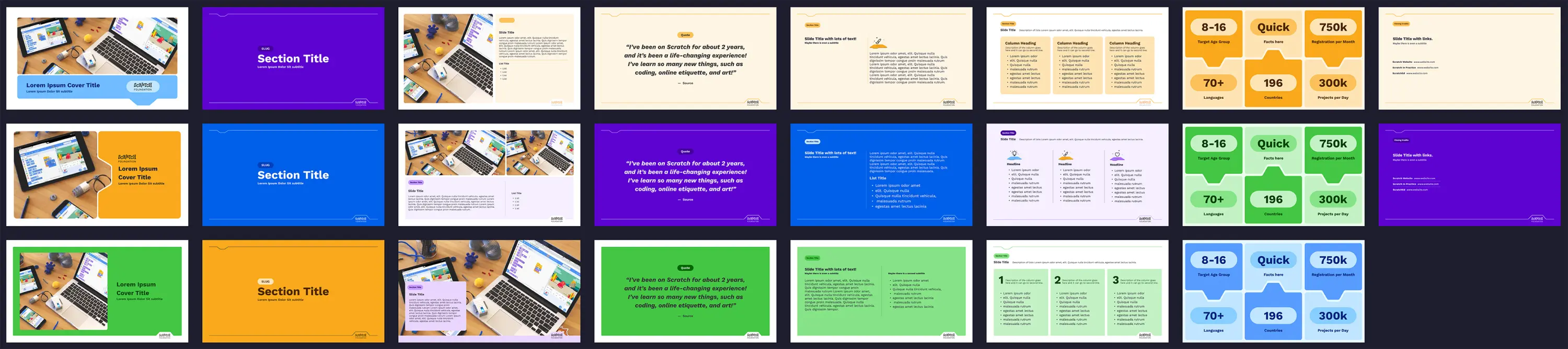
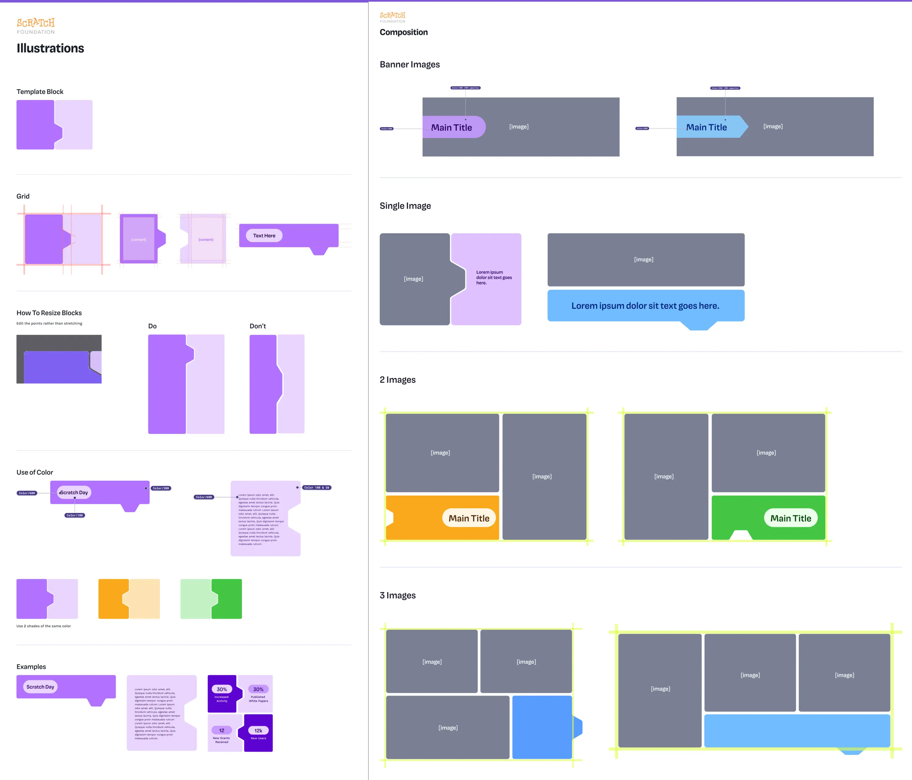
Branding
The branding work was about building a system — we didn’t need to start over. The logo carried strong equity, so we simplified the letterforms and built everything else around it:
- A new color palette used intentionally as digital wayfinding, helping users orient across sections
- A shape system derived from the interlocking coding blocks kids use in the editor
- A badge system featuring the Scratch cat, plus patterns, social templates, and new typography
The goal was to pull the playful, colorful DNA of the Scratch product into the broader brand so the whole ecosystem felt connected.
The Results & Why It Matters
Room to Create, Room to Grow
Scratch now has a single, cohesive platform that serves every audience clearly. Navigation is simpler. Content is organized around who's visiting and what they need. The visual identity feels current and credible to donors and partners while still carrying the creative energy that draws kids and families to Scratch.
The branding system ties the foundation site back to the product, reinforcing continuity across the entire Scratch ecosystem. It also gives the team tools they can use on their own: Canva templates and a flexible shape-and-color system that works across digital and print.
As the conversation around coding education evolves, Scratch is well-positioned to show up the way they always have: as a place where kids create, explore, and express themselves. The new site helps them share that story with the people and organizations who make it possible.
Work with us!
Ready to get your project off on the right foot with an EdTech-specialized team?
Let's Talk
Related Work
We partner with educational organizations to research and design purpose-driven, scalable learning experiences.