The Power of Simplicity: Making Learning Design for Everyone

When it comes to building edTech products, it can be challenging to design a complex product with an elegant interface.
You want to put your stamp on a product before it hits the market.
You also want to give your customers a new and innovative tool that solves their problems in the classroom.
The drive for complexity at this stage encourages product teams to add layers of added instruction or content.
But a simple interface often leads to a better experience for the user.
Great design is for everyone, and that rings especially true for teachers and students using edTech tools in the classroom.
Here’s a roadmap for creating a successful, transformative learning product built around the goal of simplicity.
The Value of Simplicity in edTech
Find your product north star
As designers and developers know well, there’s nothing “simple” about simplicity.
In product design, “simplicity” comes from a deeper understanding of a product’s larger goal.
Even if you and your team know what kind of edTech product you want to build, take the time to refine the purpose of your product.
Having a “north star” makes all the difference in the design and user experience.
It’s notoriously easy for UX and UI teams to get caught up in overly complex design by adding features.
With a refined purpose in mind, however, you’ll be able to cut, edit, and consolidate features easily.
By refining a solution through the lens of the product’s larger purpose, design teams and developers can also build a sleek, easy-to-use interface that teachers love and students are eager to engage with.
Design inclusively, for everyone
Even products that perform complex actions, like visualizing student data in a dashboard, should be simple and accessible.
Simplicity is especially important in edTech products because it makes design solutions more universal.
Complexity and overwrought style often result in awkward design solutions or solutions that narrow your audience.
This poses a real problem for edTech consumers, in particular.
Teachers may have little time to engage with a complex dashboard that’s difficult to learn, for example.
Because edTech products come into contact with users who have a wide range of abilities, they also need to meet benchmarks for inclusivity.
One of the best ways to think about inclusivity in edTech design is through the lens of simplicity.
What Does Simplicity in edTech Look Like?
In edTech, we often have complex experiences to facilitate.
Many edTech products are robust systems that perform complex tools.
Just think about a reading tool for young learners or an assessment tool for teachers and administrators.
The complexity of an edTech product is never the enemy of simplicity in design.
We value presenting rich topic areas to students and giving teachers powerful tools for exploring and comparing student data.
However, our goal is always to present information in a way that feels simple and intuitive to the user, no matter how challenging the product was to build.
It’s easy to design products that go too far in the opposite direction, too.
Oversimplification can result in incomplete or boring experiences for students and leave teachers with tools that don’t have the depth to achieve their goals.
So what does simplicity in edTech actually look like?
Here’s a quick guide:
Limited user options
Think hard about what goals a user wants to achieve, so you can decide which features a user needs to see, which features can be made available but remain ‘closed,’ and which features you can combine or eliminate.
Common design and interaction patterns
Simplicity is predictable.
When you use common user interface patterns, the user can guess how features function before they interact with them.
This frees up their conscious mind to make more formal decisions or learn a new concept.
This could be as simple as designing controls that look like toggle switches to allow a user to turn a feature on or off, for example, or using a magnifying glass icon to indicate the “search” function.
Clear benefits
Complicated products tend to confuse the user about the benefits of interacting with a product, or they make it difficult to determine what the goal of interaction should be.
Make it easy for users to understand why they might want to tackle learning new consonant or vowel sounds.
Help teachers understand how they can use the assessment data they’re collecting to make actionable student learning plans.
Less interface
Think about the learning experience itself.
Rather than present a video describing a physics principle followed by a series of multiple choice questions, for example, create an interactive model of an experiment that allows learners to “play” until they get it right.
Find ways in your product design to embrace experiential learning or other pedagogically sound teaching methods.
Fewer instructions
When you bog a user down with instructions, they can get confused, frustrated, or scared off.
The interface itself should encourage interaction.
This includes letting users know how much more time it might take to complete a step in a longer process.
When you use these principles in edTech product design, the result is a learning or educational tool that’s simple but robust, user-friendly, and accessible to many different kinds of users.
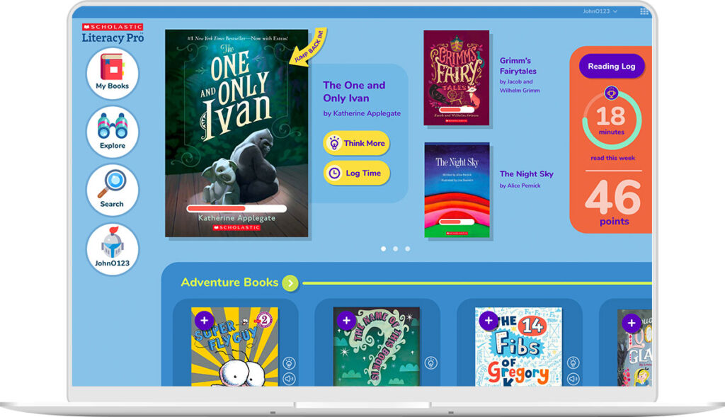
How Simple Design Widened the Audience for Scholastic’s Literacy Pro App
Literacy Pro is an independent reading app we created for Scholastic.
On launch, learners gain immediate access to books through an eReader and can begin reading after just one click.
We made this exciting — and easy to do — by including a single, dimensional object on the first screen: a book cover that invites students to click.
It required a lot of iterations to arrive at this direct interaction, but our testing showed that this pattern was so simple that students didn’t have to think about it.
Literacy Pro’s purpose was to “develop a love of reading,” not to launch an eReader or to provide reading reports for teachers.
It certainly does both of these things, but they are in service of the larger core purpose of the product.
Keeping this purpose in mind helped us make tough decisions when it came time to set priorities or cut features.
By starting this project with a simple statement of purpose (and not the product’s features or business requirements), we focused our work through the lens of simplicity to achieve the stated goal of the product.
The simplicity and elegance of our design led to students using Literacy Pro intuitively and well.
Creating a visual system for simplicity
In terms of visual design, Literacy Pro has a spare interface and a limited color palette.
A system of visual icons allows users who are new to reading, or who may have reading impairments, to search for books by category.
By eliminating instructions for how the search function works, the search interaction is as direct and simple as possible for the user.
While the design is simple, it’s still colorful and has a personality.
It’s not sterile or boring. Even though the target grade level for the product was K-3, our testing showed that it appealed to students up to 6th grade.
Done well, simplicity broadens the appeal of design and opens up your potential audience.
Simplicity & Accessibility Go Hand in Hand
Simplicity in design also results in greater accessibility.
While there are specific standards for designing accessible edTech products, solutions that are less cluttered, more direct, and more intuitive will be easier for people with visual impairments, dyslexia, and alternative learning styles to use.
You can apply our approach to accessible design to your work. It’s all about the lens of simplicity:
Limited user options
Put fewer barriers between users and the rich educational content of an educational tool.
Fewer options lessens the cognitive load required of a user and makes it easier for them to understand what to do.
This also makes the interface easier for users with different learning abilities or visual impairments.
Bold, visual communication
Rather than depending on text-heavy instructions or complicated interfaces, present choices and information more visually. Think simple infographics or clear illustrations.
This helps users with dyslexia and color blindness, or those who are visually impaired but not blind, take a visual shortcut to understanding a concept or what they should do next.
Fewer instructions
Few or no instructions means that an instructional product can transcend language, encouraging a wide range of users to engage intuitively with your product.
This is particularly important when designing for early or pre-readers.
Designing with accessibility in mind is especially crucial for edTech UX and UI teams.
Your products will wind up in the hands of many different kinds of users, including learners with different abilities.
Simplicity is an added lens you can use to design elegant, accessible solutions that make your learning products tools everyone can use.
Learning Ally’s LINK App Shows Accessible Design At Its Best
The non-profit organization Learning Ally is the world’s largest provider of audio textbooks and literature.
Their desktop and mobile app, called LINK, is an audiobook reader designed for students with dyslexia, as well as students who have learning disabilities or visual impairments.
Because Learning Ally’s audiences often approach reading with fear or worry, the interface for their audiobook reader needed to be as simple and friendly as it is powerful.
In addition to adhering to ADA best practices around color contrast and font sizes, we followed a philosophy of simplicity when creating the UX and UI design.
As you can see, the color palette for this product is intentionally limited. Using fewer colors in more deliberate ways creates a simple experience for the user.
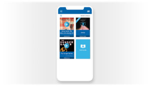
Text on every button is accompanied by an icon, and buttons are large, flat, and unadorned.
This allows for a visual reinforcement of each button’s purpose that doesn’t require reading.
We also eliminated additional instructions and how-to information, or, if necessary, we made it available only by clicking.
By leveraging existing interactive patterns, the UX for Learning Ally is also immediately familiar to users.
Recognizable patterns make it easier for students to learn how the product works.
Ultimately, familiar UX patterns are essential to any product design accessibility strategy.
Because of Learning Ally’s attentiveness to the standards of accessible design, as well as our own benchmarks for simplicity and elegance, its UX has received multiple industry design awards.
In 2018, Learning Ally was recognized in accessibility categories by Parent and Teacher Choice Awards, the SIIA CODiE Awards, and EdTech Digest’s Cool Tool Awards for its innovative, creative, and pedagogically sound approaches to reading.
Final Thoughts
Highly-accessible products for users with learning disabilities often present UX and UI teams with unique design challenges.
By following ADA guidelines around accessibility, focusing on simple design, and leveraging familiar UX patterns, your team can create successful products that meet the needs of students who have a range of abilities.
While there’s inherent value in designing edTech products for elegance and simplicity, the tangible benefits for your users make simplicity in design a win-win.
Whether you’re looking for ways to design a more satisfying learning experience for students or make your product design more accessible to users of different abilities, simplicity is key.

Sean Oakes
Sean has over 20 years of interactive design and account management experience. In 2000, Sean founded SOS, a specialized creative studio based in Brooklyn, NY. He has set the creative vision for the highly regarded firm; the power of thoughtful design and delightful user experience to enable better teaching, learning, and communication.
Sean is a graduate of the Rhode Island School of Design. His work has been recognized by The Webby Awards, Communication Arts, SXSW Interactive, Business Week, The Smithsonian, and Apple.