Website Redesign
Overview
A Website For All Students
Broward College, a two-year university in Florida dedicated to serving a diverse community of students across all ages and backgrounds, approached Backpack with a problem to be solved. They found that students who visited their website would primarily use the search function to find what they wanted, rather than navigation tools, leading to an unintuitive and unreliable user experience.
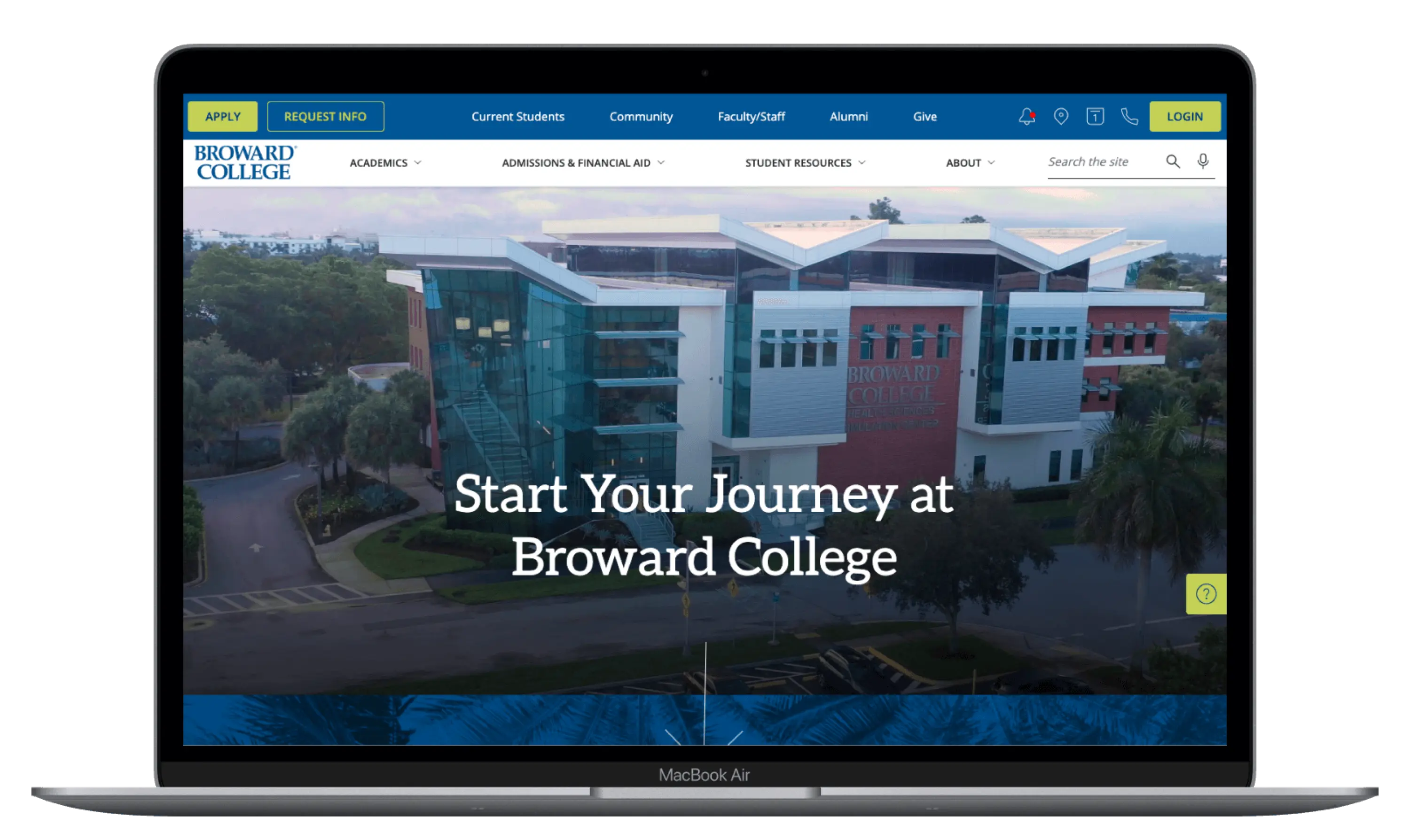
Working closely and collaboratively with the college administrators, we redesigned their site. Utilizing a design component library, we restructured their information architecture and visual language in an easy-to-replicate format – making the experience for the students simple to navigate, and easy for the Broward team to update on the backend.
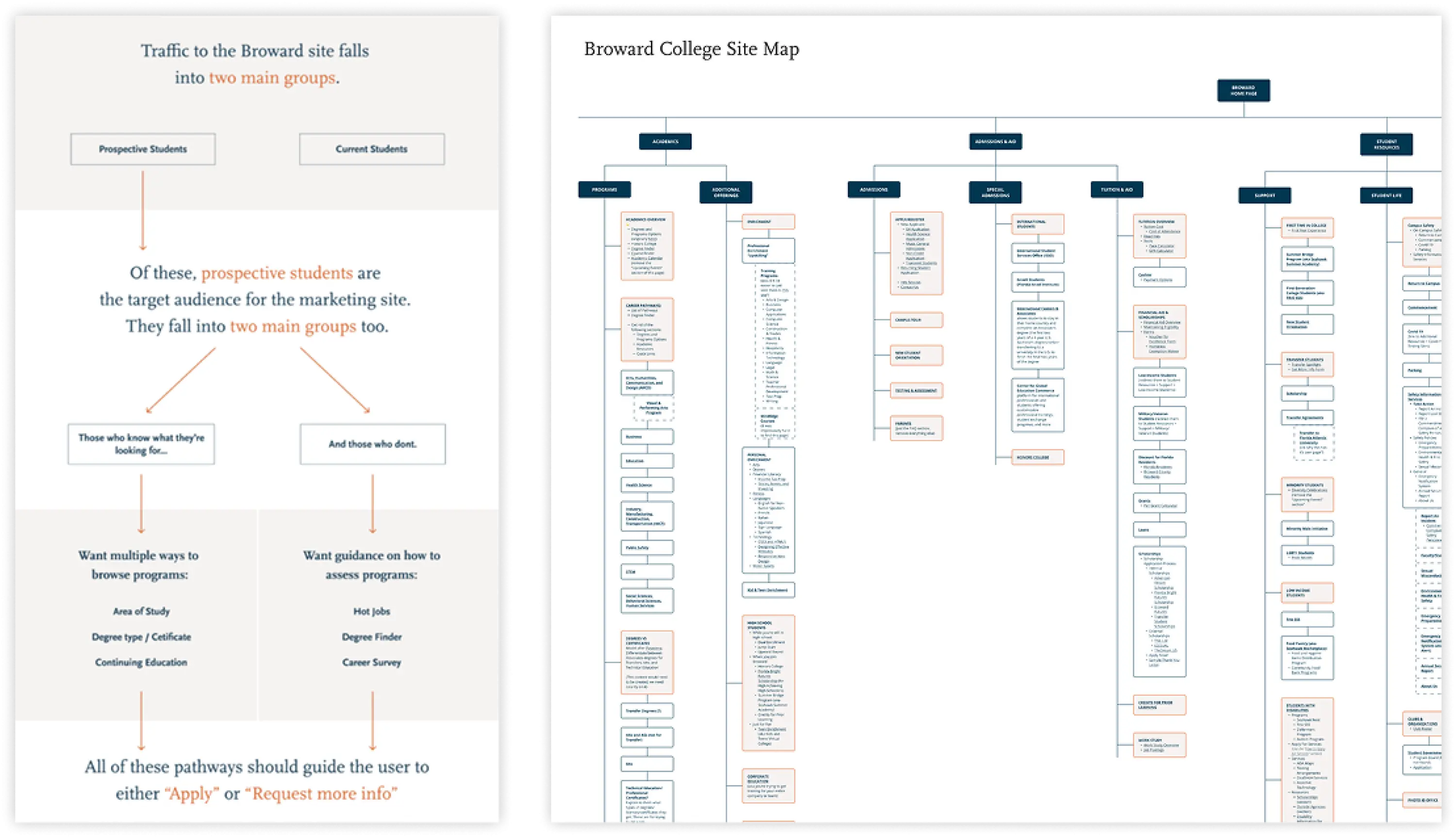
We began by auditing the existing site and creating an expansive site map to find the primary pathways through the already-existing content. Next, we developed a thorough competitive analysis of other colleges within similar website structures as Broward. We simultaneously conducted user research, walking current students through prototypes of the revised homepage designs and compiling feedback and insights from current students.
What We Did
-
Research
-
UX Research
-
-
Design
-
Wireframes
-
UX Design
-
UI Design
-
Accessibility Compliance
-

Our Approach
Planning for Clarity
Our primary goal was to improve the architecture of Broward’s website by understanding both the current user of the site and the parts of the site students would need to access. We created flow charts for four different user types using the findings we gleaned from our research, and developed the pages that would lead each student towards their own personalized solutions.
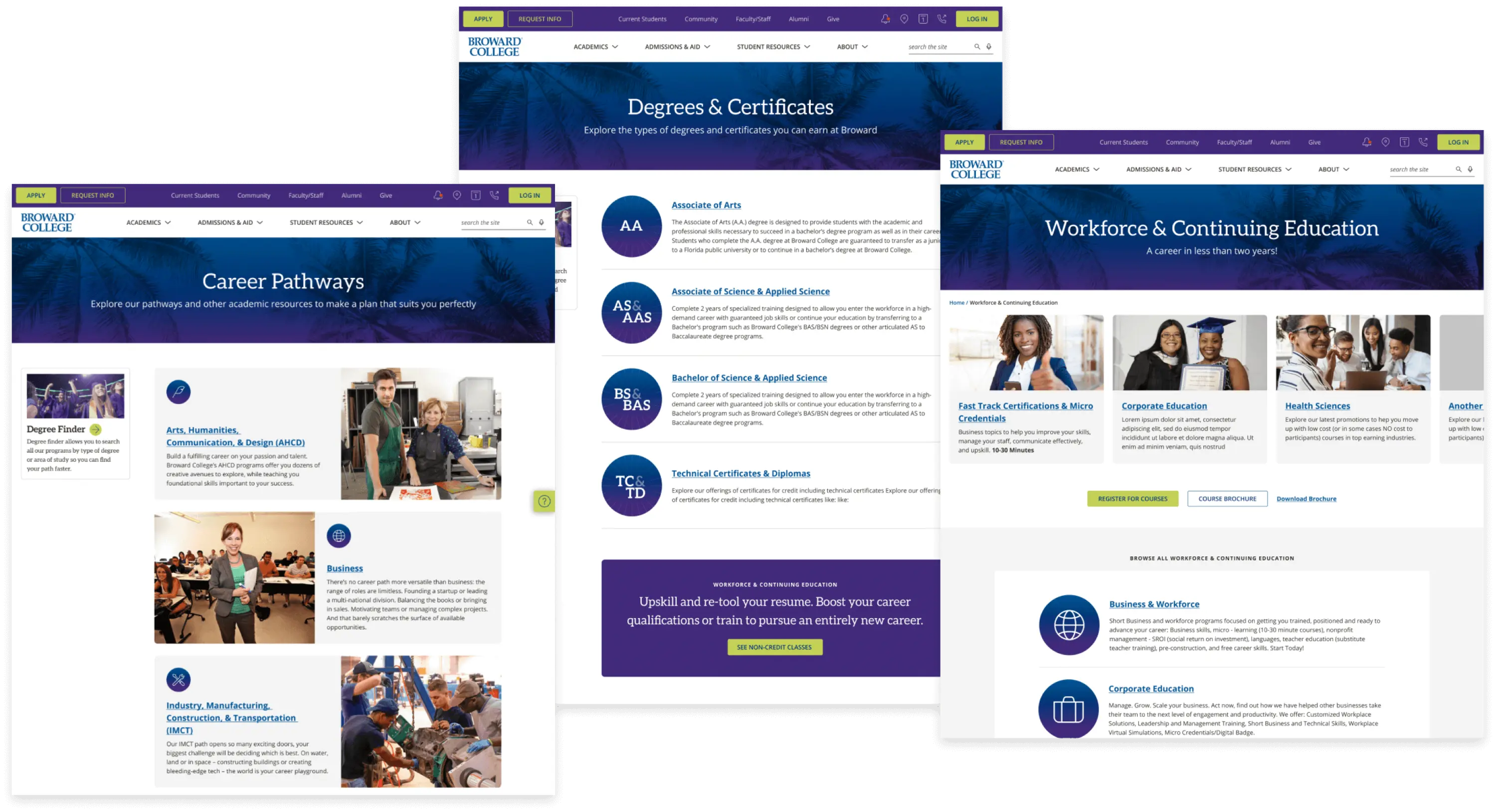
For Broward, it was important to convey their buildable degree structure; that you could start with smaller technical certificates, and build towards higher degrees at the same time. We wanted to tell a story of a prospective student’s journey as you travel through the site – choosing a career path, and viewing how Broward could help you work towards those higher degrees.

Key Solutions
Simplifying Systems
Broward’s pre-existing website structure consisted of “component blocks” that allowed the faculty and staff to easily add relevant class information to the website. It was important to the administration that this system be kept in place for simplicity of development – maximizing design impact for their internal team to use when adding future content.
Our goal, therefore, was to simplify the visual design while keeping this structure in place. We redesigned the home page completely, utilizing existing component blocks and adding mobile browser compatibility and a few new custom-built components. We also populated support pages that would lead students to their destination (along with Lifestyle and Accolades sections), and created landing pages with clear language for eight different career pathways.
We found that this approach worked well and the final updated homepage was rolled out in November of 2022 to praise from administrators and students alike. Updating the Broward online infrastructure was an excellent opportunity to give prospective students a cleaner understanding of the curriculum Broward has to offer, as well as implement the tools that faculty and administrators will use to build new pages in the future.


Work with us!
Ready to get your project off on the right foot with an EdTech-specialized team?
Let's Talk
