My.Future
Overview
When Comcast and NBCUniversal teamed up with the Boys & Girls Clubs of America to transform the way their young members experience technology, they engaged Backpack to launch My.Future. The next-generation technology initiative personalizes the experience for each member through engaging project-based activities. My.Future helps kids develop skills to perform well academically, graduate from high school, become college- or career-ready, and prepare for the demands of a technology-driven society.
The site interfaces with Mozilla Backpack to allow Coaches to issue digital badges for Club Member achievements. The structure of the site allows lessons to be lead by Coaches for less experienced kids or be self-directed for the more advanced Club Members.
What We Did
-
Research
-
Prototyping & Usability Testing
-
UX Research
-
-
Design
-
Wireframes
-
UX Design
-
UI Design
-
Illustration & Animation
-
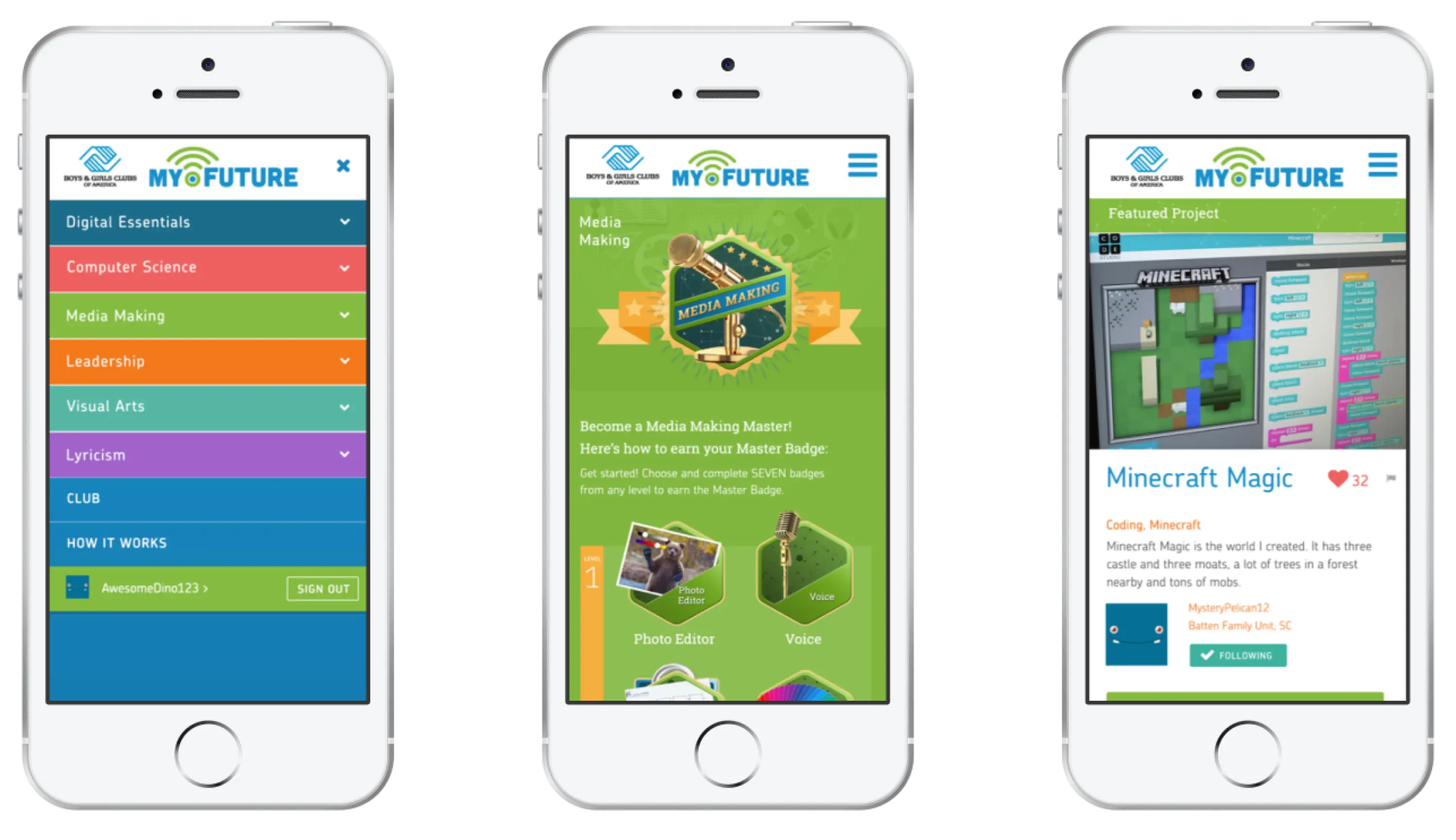
Discovery
The Club Member Experience
After a deep analysis of the client’s content and curriculum, we developed concepts for the site’s structure and experience. Here, we assessed possibilities for information organization and navigation. The result was a collaborative process between BGCA and our team to yield high-level wireframes and potential creative solutions that satisfy both the business and users’ requirements.
For My.Future, we sought to provide large clear blocks of content organized by as few navigational choices as possible. This straightforward approach made for a clean, relatively “flat” overall sitemap that had several way to get users quickly to the content they wanted.
As Club members complete activities, they can upload evidence of their creation to get credit for completion and earn badges. They can also check in around their community to be inspired by what other kids and clubs are doing. For Club members ages 8–14 we know this community is the key to motivating them to strive and broaden their minds to what’s possible.
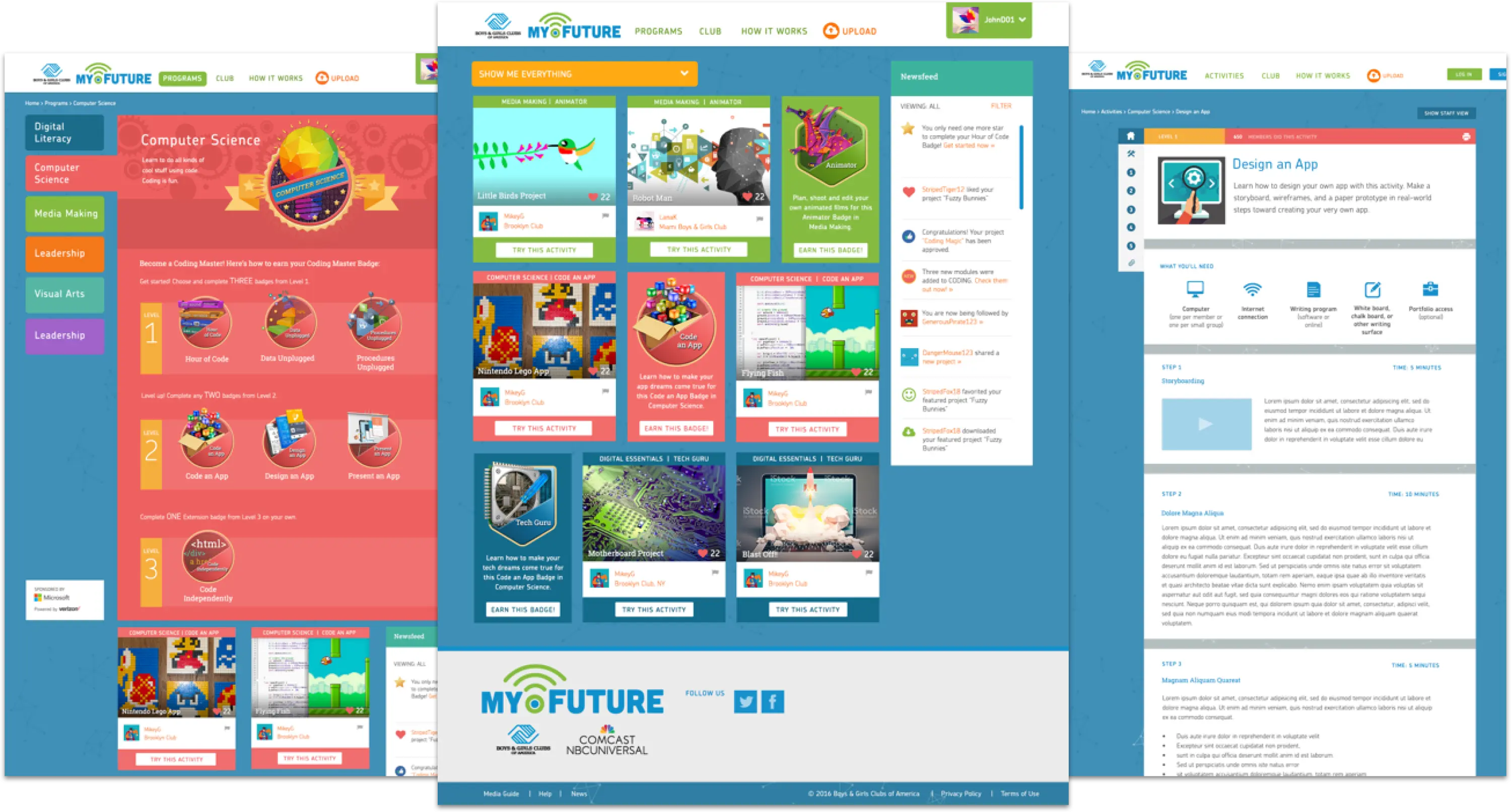
UX Design
The wireframes were created as clickable prototypes that showcased the simple user flows and intuitive interface. After multiple iterations with the team, these prototypes were presented to club members for feedback to inform the final product design.
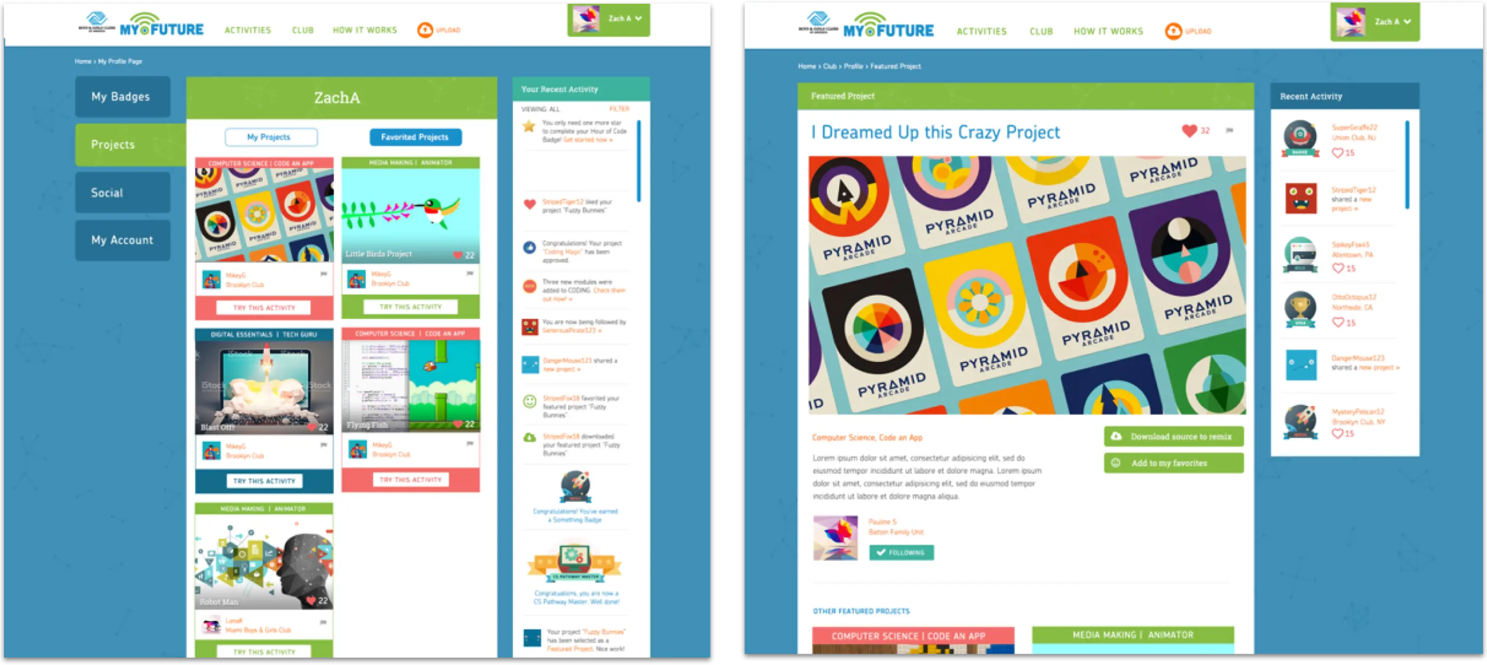
Visual Design
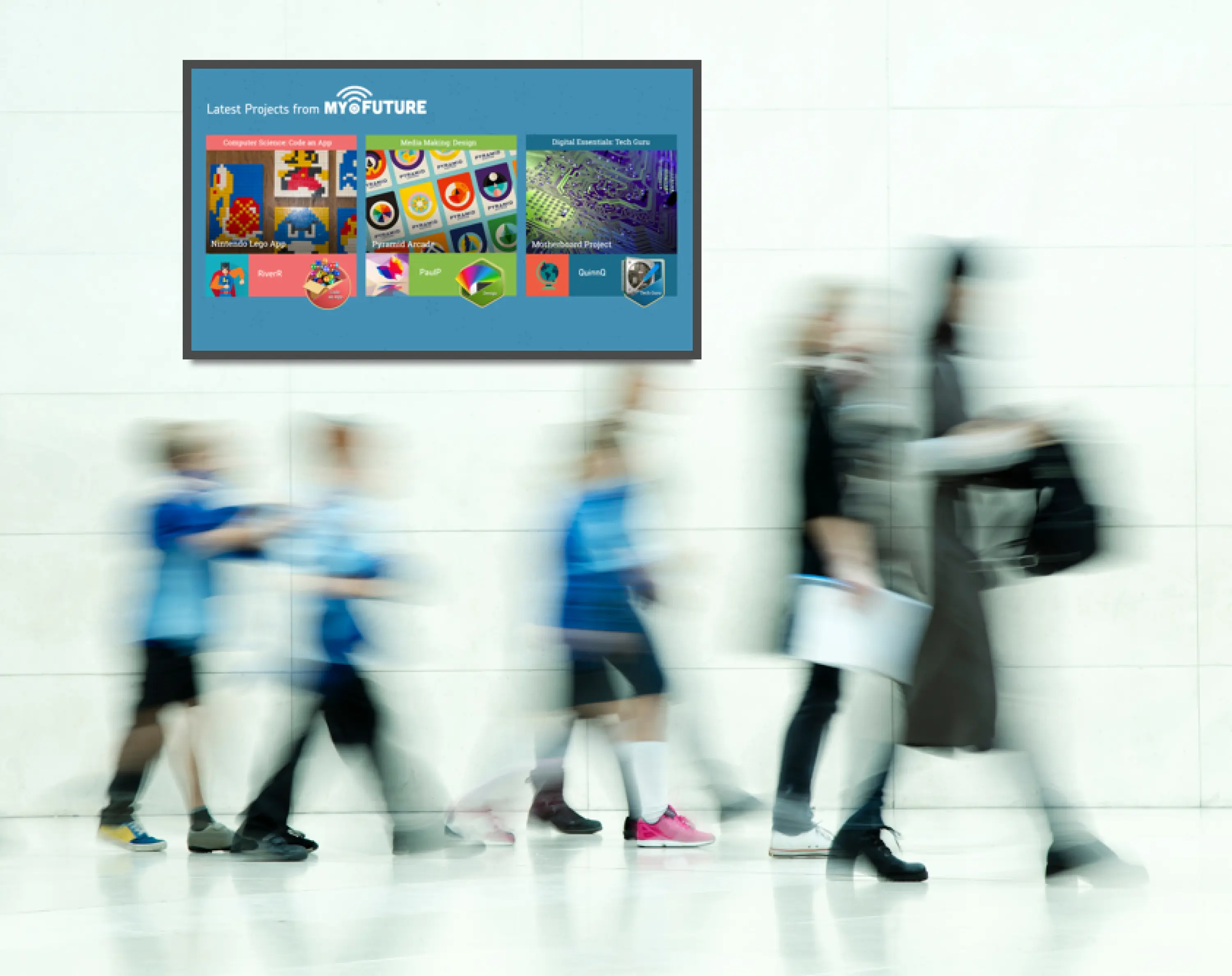
In-Club Display
After conducting research with club members using our interactive prototypes, we shifted into visual design. Our team created a flat, colorful look that combines eye-popping illustrations with clean, airy layouts. Surveys with our end users helped guide the visual direction for the digital badges. The front-end is slick, responsive and lightweight. The back-end content management system was developed using Sharepoint.
Throughout the process we were careful to keep in mind that Clubs are specific environments. We made multiple visits to Clubs to test the platform in action and make adjustments based on our observations. It became clear that there was an opportunity to build excitement around My.Future achievements even when kids were not in the computer lab. We designed a real-time display to celebrate the latest projects and badges from members.
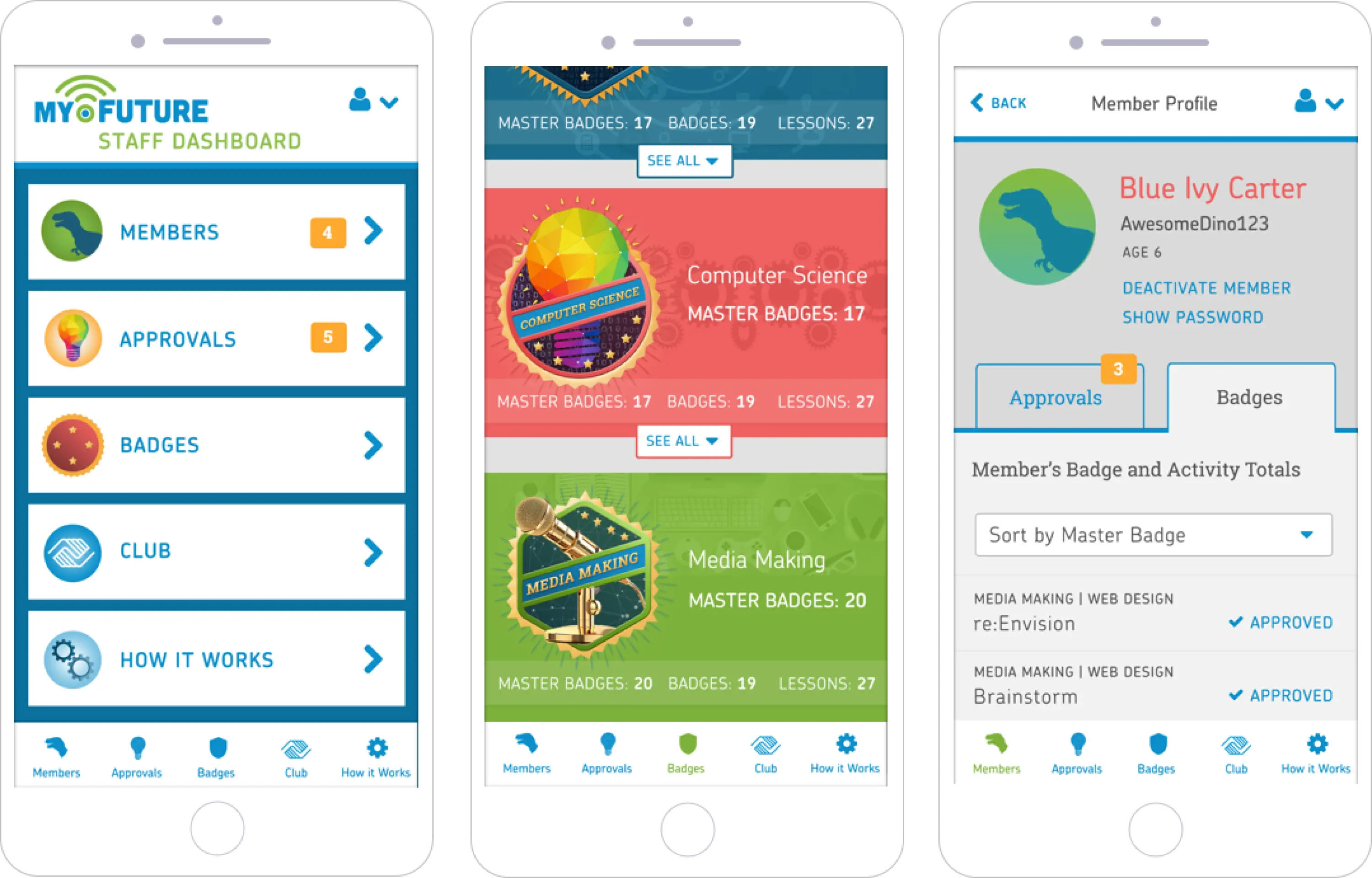
Putting Staff in Control
Staff Dashboard Mobile App
Creating an easy-to-use mobile app for adult and teen club staff was a critical piece of the project. This app allows staff to monitor progress, assist with log in issues and award acheivements. They can also get tips and training on the spot. We made this component as fun and easy to use as the site itself.
Work with us!
Ready to get your project off on the right foot with an EdTech-specialized team?
Let's Talk
