How edTech Can Support Educator Burnout: edTech UX Tips Vetted by Teachers
There’s a crisis brewing in education: teacher burnout. In fact, in a 2022 survey conducted by Gallup, 44% of K-12 education workers described feeling burned out at work “Always” or “Very Often.” As educators grapple with burnout symptoms like frustration and fatigue, they are turning to edTech for time-saving solutions to lighten the lift in the classroom.
In order to ensure that edTech companies design effective UX for their products, we conducted user research on burnout with our in-house Teacher Council. Members of the council shared pain points from their classrooms, described favorite edTech products, and identified the product features that save them time and energy.
Apply the results of our research to the next iteration of your learning tool, so you can make educators’ responsibilities easier to tackle—and make your tool more valuable to time-strapped users.
edTech UX patterns that support teachers and ease burn out symptoms
To better serve teachers, edTech publishers must ensure their digital products include features that will improve a user’s ability to efficiently tackle heavy workloads.
Unfortunately, many existing learning products follow outdated or illogical UX patterns. These UX design choices may meet an arbitrary business requirement, but they no longer serve teachers well.
Instead, opt for patterns and features that support teachers’ needs throughout your iteration and design process. These include:
- Streamlined logins via SSO and learning management system integrations, especially for popular services like GoogleClassroom and Canvas
- Sophisticated user customization options throughout the experience
- Preloaded templates and frameworks that support task completion, as well as the ability to save, edit, and reuse documents created from templates
- Modals that allow teachers to capture observational data quickly and access data points easily
- Simplified user flows that reduce the number of clicks it takes for a user to reach their end destination
By advocating and prioritizing these experience solutions, you’ll create a more valuable edTech product that helps teachers who are chronically strapped for time, worn down, and burned out.

3 edTech products teachers love—and how to apply their UX patterns to your learning tools
In our interviews with members of our Teacher Council, three edTech products came up in conversation over and over again.
Below, we outline why teachers appreciate the user experiences of GoogleDrive, Slack, and Google Forms. Use our findings and apply them to your own learning tools, in order to improve or streamline your teacher-facing experience.
Notable edTech UX Patterns from GoogleDrive
- Autonomy over file organization and naming systems
- Integration, sharing, and collaboration features
- Single-system simplicity
GoogleDrive isn’t just a popular storage system for teachers. The product also gives them autonomy over their files, allowing them to use an organizational system that works best for them. This includes features like customizable file names.
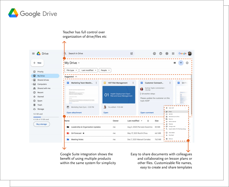
With added integration and sharing features, GoogleDrive makes common tasks easy to accomplish. Teachers can create different types of documents within a single product system, then quickly share those documents with colleagues. Everything from collaborating on lesson plans to creating and sharing templates with teammates happens all in one place.
If your edTech product requires a resource repository, consider giving users simple organizing and sharing features. Better yet, integrate your product with GSuite to leverage existing, popular tools, making your own product more valuable to busy teachers.
Notable UX Patterns from Slack
- Synchronous and asynchronous communication and sharing
- Common UX patterns from instant messaging tools facilitates quick communication and user onboarding
The shift to at-home learning made communication tools like Slack very popular among teachers. The result? Users now expect robust synchronous and asynchronous collaboration and communication abilities from edTech products with chat features.
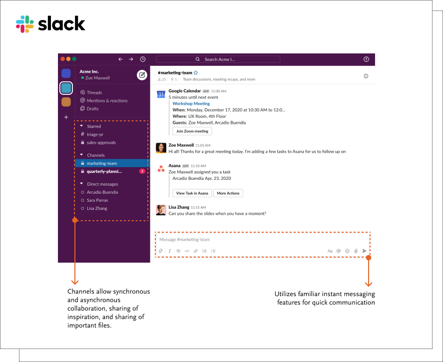
Slack’s UX patterns look and feel familiar to teachers who already use instant messaging features in other products. If you need to build collaboration features into your product, you can draw from these common UX patterns to facilitate quick communication between teachers, students, and even parent personas.
Notable UX Patterns from Google Forms
- Customizable fields
- User-friendly note and data collection
- Integrations that reduce administrative work
Whether teachers are conducting classroom observations or collecting student data, they need customizable data collection tools. In particular, giving users the ability to customize form fields means both teachers and administrators can use a single product for many different use cases or scenarios.
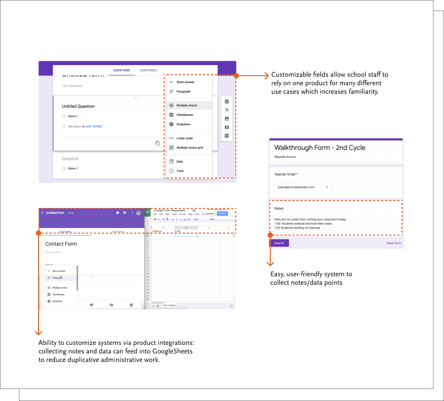
Without strong product integration, your data collection tool might actually add to a teacher’s workload. To be valuable to teachers, your learning tools should leverage integrations with common products to reduce administrative work.
It’s up to those of us who influence feature prioritization to advocate for teachers’ needs and support features that will reduce the time it takes to perform administrative tasks.
When we apply efficient technological solutions to teachers’ most demanding administrative work, we’re giving them much-needed time back in their days. With more demands on teachers than ever before, time is the single, most valuable resource an edTech product owner can prioritize for their users.
That way, teachers can concentrate on doing what they do best—teaching and supporting the students who need them.

Monica Sherwood
Prior to entering the UX field, Monica was a special educator at public schools in Brooklyn and Manhattan. Her experience as a teacher has allowed her to develop a deep appreciation for research, and the ability to empathize with the unique needs of every user. She is also a strong advocate for inclusion and accessibility in design.
Monica obtained her undergraduate degree at NYU’s School of Individualized Study, and her Masters in Special Education at Hunter College. In her free time, she enjoys traveling, painting, and reading.

